Art for Low Ceilings: Clever Ideas That Work

The fastest fix for art in a short room isn't a smaller piece, it's a lower hanging height. When you walk into a space with a 7.5-foot ceiling, your eye lands about 57 to 63 inches off the floor, and that's exactly where the art should sit. The issue is that almost nobody hangs it there.
Most homes default to hanging art too high, usually level with door and window trim. In a room with standard 8-foot ceilings that mistake is mildly annoying. In a basement or cottage with a 7-foot ceiling, it's brutal.
So we're going to walk through what actually works, and the logic behind each move.
art for low ceilings
Hang art lower than you would in a tall room. Aim for the artwork's center at 54 to 56 inches off the floor. Choose horizontal pieces over vertical ones.
Keep 6 to 10 inches of clear wall between the art's top edge and the ceiling. Fewer, larger pieces beat a crowded gallery wall.
Why Low Ceilings Break the Normal Art Rules
The standard advice assumes a tall room. In a standard 8 or 9-foot space, there's plenty of wall above eye level for the art to breathe into. The eye reads the art, then travels upward with no strain.
The ceiling is high enough that it never becomes part of the composition.
Drop the ceiling to 7 feet and everything changes. The wall area above eye level shrinks dramatically. A vertical piece hung at museum height suddenly crowds the ceiling line.
The eye gets pulled up to the ceiling, and now you notice how short the room is.
Low ceilings also change how furniture sits in the room. A tall headboard, a tall sofa back, or a bookshelf can eat the vertical wall space you thought you had. The art ends up sandwiched between the furniture and the ceiling with almost no room to breathe.
So the rules have to flip. Instead of thinking vertically, you think horizontally. Instead of hanging high, you hang at or below eye level.
Instead of filling the wall, you let the wall breathe.
It sounds counterintuitive until you see it. A wide horizontal piece hung low makes a short room feel calm and settled. A tall vertical piece hung high does the opposite.
The One Rule That Fixes 90% of Low-Ceiling Art Problems: Drop Your Horizon Line
Your horizon line is where the composition of the room settles. In low-ceiling spaces, that means the center of your art should sit between 54 and 56 inches off the floor, not the 57 inches often cited for galleries.
That 1 to 3 inch drop is small, but it does real work. It moves the art below the viewer's natural gaze rather than at or above it. The eye relaxes downward, away from the ceiling, and the room feels taller than it should.
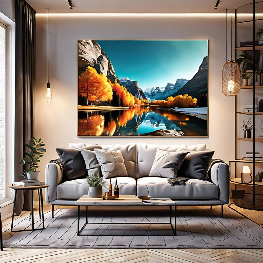
Image source: Bing (Web (fair-use with source credit))
Here's the practical method our research points to for setting that line:
- Measure the wall from floor to ceiling. Note the number.
- Multiply that height by 0.68. That gives you the art's center point in inches.
- For a 7-foot (84-inch) wall, that's roughly 57 inches. For a 7.5-foot (90-inch) wall, about 61 inches.
- Subtract 2 to 3 inches from that number for low-ceiling rooms.
- Mark the final number on the wall with painter's tape before you hang anything.
What you're solving for is a visual anchor, not a formula. If the art sits too high, it competes with the ceiling. If it sits too low, it looks like it fell.
The sweet spot is somewhere your eye lands without effort.
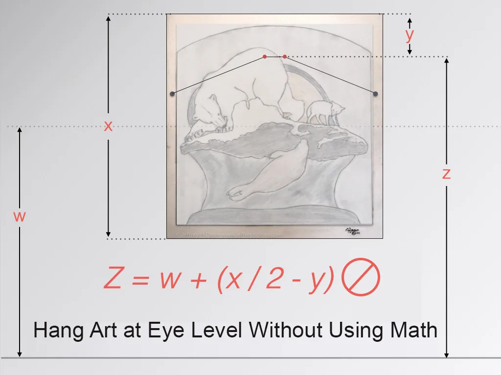
Image source: Bing (Web (fair-use with source credit))
If you're hanging above furniture, the same logic applies but with an extra variable. The gap between the bottom of the art and the top of the furniture should be 4 to 8 inches. Anything less looks glued.
Anything more floats. Same rule for a sofa, a headboard, or a credenza.
If the furniture is unusually tall (a headboard over 5 feet, for example), skip the wall behind it entirely. Redirect the art to a side wall or above a lower piece of furniture.
Horizontal Beats Vertical (Almost) Every Time — Here's When It Doesn't
Horizontal art mimics the shape of the room. A wide canvas reads as a horizon line, and horizons make spaces feel wider, not shorter. That's the core reason landscape-format pieces dominate in low-ceiling rooms.

Image source: Bing (Web (fair-use with source credit))
Vertical art does the opposite. A tall canvas stretches the eye up, and in a short room the eye hits the ceiling fast. The result reads as cramped rather than elevated, even when the piece itself is beautiful.
So when does vertical art actually work? There are a few cases.
- You have a narrow wall where the only option is vertical. A tall narrow canvas in a skinny niche can work if it's hung low and doesn't bump the ceiling.
- The ceiling is sloped, not flat. A-frame and attic spaces with high sloped ceilings give vertical art somewhere to go.
- You're using a series. Three narrow vertical pieces side by side reads horizontally even though each one is tall.
- The vertical piece is short. A 20×24-inch portrait canvas isn't the same as a 30×60-inch tower.
Here's a quick side-by-side look at how the two formats behave in a low-ceiling room:
| Factor | Horizontal art | Vertical art |
|---|---|---|
| Effect on perceived height | Widens the room | Draws eye to ceiling |
| Best wall type | Long horizontal wall | Narrow niche or sloped ceiling |
| Ideal aspect ratio | 1:1.5 up to 1:4 | 1:1.2 up to 1:1.4 |
| Works above furniture | Yes, widely | Rarely, unless small |
If you're torn between formats, go horizontal. You'll almost never regret it in a short room. The one exception is if you have a beautiful, tall, skinny wall that genuinely needs filling, and even then, keep the top of the piece at least 8 inches below the ceiling.
How to Size and Space Art on a Short Wall
Sizing art for a short wall is about ratios, not absolute dimensions. A 36×24-inch piece on an 8-foot wall looks balanced. On a 7-foot wall with a soffit cutting it to 6 feet, that same piece might look overwhelming.
Reading the wall-to-ceiling ratio
Start by measuring usable wall height, not total ceiling height. If there's a soffit, bulkhead, or ductwork enclosure, that's the real ceiling as far as your art is concerned.
A good working rule is that the art should occupy 60 to 75 percent of the usable wall width. Vertically, the art shouldn't exceed about half the usable wall height. That keeps headroom around the piece so it doesn't look boxed in.
For a 7-foot wall with a 6-foot usable height, that means art under about 36 inches tall. Wider is fine. Taller is not.
The 6–10 inch ceiling gap and the 4–8 inch furniture gap
Two gaps shape the whole composition:
- Ceiling gap: 6 to 10 inches of bare wall between the top of the art and the ceiling. Anything less looks crammed.
- Furniture gap: 4 to 8 inches between the bottom of the art and the top of whatever sits below it (sofa, bed, credenza, console).
If the ceiling is sloped or has a soffit, measure the gap from the lowest point of the ceiling above the art. That's the real constraint.
One large piece vs. a gallery wall in a tight vertical envelope
Gallery walls are the easiest thing to get wrong in a short room. Ten small frames on a 7-foot wall turn into visual noise fast. The eye can't rest anywhere, and the ceiling feels closer than it is.
Go with one large piece, or a small cluster of three to five at most. If you want the gallery-wall look, keep it horizontal and evenly spaced. Two inch gaps between frames, all hung on the same visual line.
It reads as a single unit rather than a pile of smaller ones.
If you've already got a gallery wall and it feels heavy, try thinning it. Pull two or three pieces, swap one for a larger horizontal, and reset the whole group lower on the wall by 2 to 3 inches. The change is often dramatic for very little effort.
Frame, Glazing, and Finish Choices That Don't Steal Headroom
Frames matter more than people think in low-ceiling rooms. A deep box frame or an ornate gold number adds visual weight, and that weight reads as height you don't have.
Here's what our research and aggregate design guidance suggest:
- Go thin. Slim-profile frames (0.75 to 1.25-inch face width) disappear and let the art carry the visual load.
- Match the frame to the wall, not to the furniture. Wall-matched frames blur the boundary and make the room feel larger.
- Skip ornate. Heavy carvings, deep bevels, and gold leaf all push the eye up.
- Choose frameless when you can. Canvas wraps and gallery wraps sit nearly flush.
- Narrow your mats. Wide mats on small art add visual real estate without adding content.
Glazing is the sneaky one. Glass reflects. In a low-ceiling room with recessed lights or a nearby lamp, glazing can catch bright streaks and pull attention up to the ceiling.
If the piece is going in a space with nearby overhead lighting, use anti-reflective glass or acrylic, or choose a piece that doesn't need glazing at all, like a canvas or a painted panel.
Reflective glazing is also worth reconsidering in rooms with windows at eye level. Windows near the art create double reflections that can wash out the whole piece.
Finally, think about the wall color behind the art. High-contrast walls (dark art on white, or light art on black) draw the eye to the boundary between the piece and the wall. In a short room, you want the eye to settle inside the art, not trace its edges.
Softer contrast between art tones and wall tone keeps attention where it belongs.
Placing Art Around Soffits, Beer Windows, and Awkward Anchors
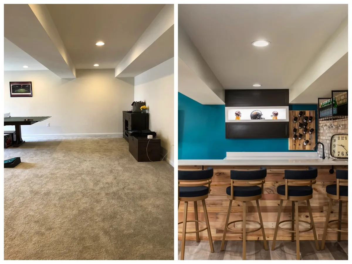
Image source: Bing (Web (fair-use with source credit))
A soffit is a dropped section of ceiling, usually boxing in ductwork or structural beams. A beer window is a small, high horizontal window near the ceiling, common in basements and mid-century homes. Both of these architectural features mess with the clean hang line you'd otherwise use.
Here's how to work around them.
For soffits, treat the underside of the soffit as your ceiling. Don't try to span art across the transition between the full-height ceiling and the soffit. Instead, hang art entirely below the soffit line, with the same 6 to 10-inch gap you'd use from a regular ceiling.
For beer windows, the challenge is that the window sits at roughly the height your art would naturally want to be. Don't compete. Either skip the wall entirely (put art on an adjacent full wall), or hang a horizontal piece well below the window, using the window as part of the wider composition.
A wide canvas hung under a beer window can look intentional if the alignment is clean.
For awkward anchors, like electrical panels, thermostats, or HVAC returns, you have two options. Cover them (a large canvas on a hinge or a leaning piece works) or design around them. Covering looks better when the anchor is small.
Designing around looks better when it's large.
If the awkward anchor is on the wall you want art on and it's load-bearing or code-restricted, don't block it. Redirect to a different wall. No art piece is worth covering your electrical panel.
One more thing: if you're dealing with a soffit that runs across the top of a wall at an angle, hang your art low and centered on the longest clean stretch of wall below it. Trying to align art with an awkward soffit angle almost always looks off.
Mistakes That Make a Short Room Feel Shorter
Hanging art too high is the number one mistake, and it shows up in almost every low-ceiling room we've looked at. If the top of your frame sits within 6 inches of the ceiling, that's the culprit. Drop it 2 to 3 inches and the whole wall settles.
The second mistake is overloading the wall with small pieces. Six or eight small frames scattered across a 7-foot wall creates visual static. The eye has nowhere to rest.
One large horizontal canvas will always read cleaner than a cluster of small ones in a short room.
The third is choosing deep, dark, ornate frames. Heavy frames read as ceiling in the eye's proportions. Swap for a thin light frame or a frameless canvas and the piece looks like it's part of the wall, not fighting it.
The fourth is ignoring the ceiling line when the art sits under a soffit. If the soffit cuts the wall to 6 feet and you hang art as if the wall is 8 feet tall, it looks squished. Always measure to the real constraint, not the imagined one.
The fifth is placing art behind furniture that's too tall. A four-foot headboard with a canvas hung above it and no room below looks claustrophobic. Skip art on that wall entirely, or move it to an adjacent wall with more vertical clearance.
Finally, reflective glazing catches overhead light and drags the eye upward. That's the last thing you want in a low-ceiling room. Anti-reflective glass, acrylic, or unglazed canvas solves it for good.
Picture Ledges and Leaning Art: The Low-Effort Alternatives
Picture ledges solve two low-ceiling problems at once. They hold art without nails, and they let you swap pieces whenever you want. For anyone in a rental, in a home with awkward plaster, or in a room where they keep changing their mind, a ledge is often the smarter move.
A picture ledge is a shallow shelf, usually 1.5 to 2.5 inches deep, mounted to the wall. Art leans back against the wall on the shelf. The result is a clean horizon line at the ledge and art above it, plus small objects or books beside the art.
The rule for placing a ledge in a low-ceiling room is the same as for framed art. Mount it so the top edge of the tallest piece you plan to display sits 6 to 10 inches below the ceiling. Lean pieces at slightly different heights for variety, but keep the longest pieces at the back so they anchor the arrangement.
Leaning art on the floor is another option. A large canvas leaning against the wall behind a sofa or console reads as intentional and casual. In a low-ceiling room, floor-leaning art has a real advantage: it starts the eye low and the composition grows from the ground up, which counteracts the ceiling's depression.
The catch is stability. Tall, narrow pieces on the floor can tip. A small piece of museum putty under the base or a hidden bracket behind the art stops it.
For heavy pieces, a floor easel or a plate stand rated for the weight is the safer pick.
Rotating art on a picture ledge is another way to fight low-ceiling fatigue. If a piece starts to feel suffocating, swap it for something lighter or wider. No new holes, no repainting.
Just a two-minute change.
Does Gallery Wall Spacing Change in Low-Ceiling Rooms?
Yes, gallery wall spacing tightens in low-ceiling rooms. The universal 2 to 3-inch gap between frames still applies, but the overall cluster should be wider and shorter rather than tall and narrow. If you're building a gallery wall under a 7-foot ceiling, aim for a group that spans more width than height.
The clearest way to plan a gallery wall in a short space is with paper templates. Cut paper to the exact size of every frame, tape them to the wall, and step back. You'll see instantly whether the composition sprawls or crowds.
Move templates around before you commit to a single nail.
Here's the spacing guide our research keeps landing on for low-ceiling rooms:
| Element | Standard room | Low-ceiling room |
|---|---|---|
| Gap between frames | 2 to 3 in. | 1.5 to 2.5 in. |
| Total cluster height | Up to 60 in. | Under 40 in. |
| Total cluster width | Varies | At least 1.5x the height |
| Pieces per cluster | 5 to 12 | 3 to 5 |
| Top of highest frame from ceiling | 8 to 12 in. | 10 to 14 in. |
Shorter, wider clusters read as one unit. Taller clusters read as a stack and pull the eye up.
Alignment matters more than variety in a short room. Pick one line (the centerline, the top edge, or the bottom edge) and align at least three frames to it. The eye latches onto the pattern and stops scanning the ceiling.
If you already have a gallery wall and it feels off, try this: remove the tallest piece, replace it with a horizontal, and lower the whole cluster by 2 inches. That single change fixes most low-ceiling gallery walls.
For shelves mixed with art, keep the shelf empty of tall objects. Vases and lamps above a picture ledge add vertical mass you don't need. Stick to low-profile objects and let the art do the talking.
Frequently Asked Questions
How high should I hang art with a low ceiling?
Aim for the artwork's centerline at 54 to 56 inches off the floor. That's a couple of inches lower than the museum standard of 57 inches. The goal is to pull the eye away from the ceiling.
For a 7-foot wall, keep the top edge at least 6 inches below the ceiling.
Is horizontal art always better than vertical in a low-ceiling room?
Horizontal art is better in almost every case because it mimics the room's proportions. Vertical pieces can work in narrow niches, under sloped ceilings, or as part of a three-piece series that reads horizontally when grouped. If you're unsure, go horizontal.
Can I hang a gallery wall in a basement with 7-foot ceilings?
Yes, but keep it small, wide, and low. Use three to five pieces at most, aligned on a single horizontal line. Keep the top of the cluster at least 10 inches from the ceiling.
A tight grid reads cleanly where a scattered arrangement would look chaotic.
What frame should I use under a low ceiling?
Go thin and wall-matched. Slim frames (0.75 to 1.25-inch face width) disappear into the wall. Frameless canvas wraps work even better because they sit nearly flush.
Avoid deep box frames, ornate carvings, and heavy gold or dark finishes that add visual weight.
How do I hang art around a soffit or dropped beam?
Treat the soffit as the real ceiling. Hang art entirely below it, with the standard 6 to 10-inch gap measured from the soffit's underside, not the original ceiling height. Don't span art across the transition between the full ceiling and the soffit, since the alignment almost always looks off.
Does art color matter in a low-ceiling room?
Yes. Light, low-contrast palettes recede and make the room feel taller. Dark, high-contrast pieces draw more attention and can dominate a short wall.
Open horizons, skies, and minimal landscapes work especially well because they echo the shape of the room.