Black Frames on White Walls: Bold Decor Guide
Black frames on white walls are the single most reliable way to make artwork stand out. The contrast does the heavy lifting, so your art reads as a focal point instead of blending into the paint. But high contrast is unforgiving.
Get the frame width, mat, or spacing wrong, and the same setup can look cheap, harsh, or off-balance.
The good news is that the rules are not a mystery. Museum and gallery display standards put the center of a hung piece at roughly 57 to 60 inches from the floor. That single number does more for a wall than any expensive frame.
Here's how the visual mechanics actually work, and how to plan a layout you won't want to redo.
black frames on white walls
Black frames on white walls create maximum contrast, so artwork reads as the focal point. The dark frame separates the art from the bright wall behind it. This works with almost any style, from photography to line art.
Frame width, mat size, and spacing decide whether it looks curated or chaotic.
The Visual Mechanics: Contrast, Negative Space, and Focal Points
This is the part most people skip, and it's why so many black-frame walls miss the mark. A black frame on a white wall is a hard visual edge. Your eye snaps to it fast, which is exactly what you want.
But that same edge also sharpens every mistake in proportion and spacing.
Negative space is the air around and inside the frame. It includes the mat between the art and the frame, plus the wall area around the frame itself. When negative space is balanced, the art feels intentional.
When it's cramped, the whole arrangement feels tense.
How black frames change the way your eye moves across a wall
Picture the wall in the photo above. One black frame sits centered on a bright white field. Your eye goes straight to the frame, then inside to the art.
That's a single focal point, and it's the cleanest use of the contrast.
Add a second frame of the same size, and the eye now scans between two points. Add six more, and the eye stops reading individual pieces. It reads the group as one shape.
That shift is why gallery walls with black frames live or die on layout, not on the art itself.
The role of mat width and wall texture
The mat is the buffer between art and frame. On a white wall, a white mat lets the black frame float. A black mat instead merges with the frame, making the whole piece heavier and bolder.
Wall texture matters more than people expect. Smooth drywall gives you crisp, hard edges. Orange peel or knockdown texture softens the edges slightly, which can make thin frames look busier.
In our research, flat and eggshell finishes tend to work best behind black frames. Satin and semigloss reflect light, and that reflection fights the frame's own sheen.
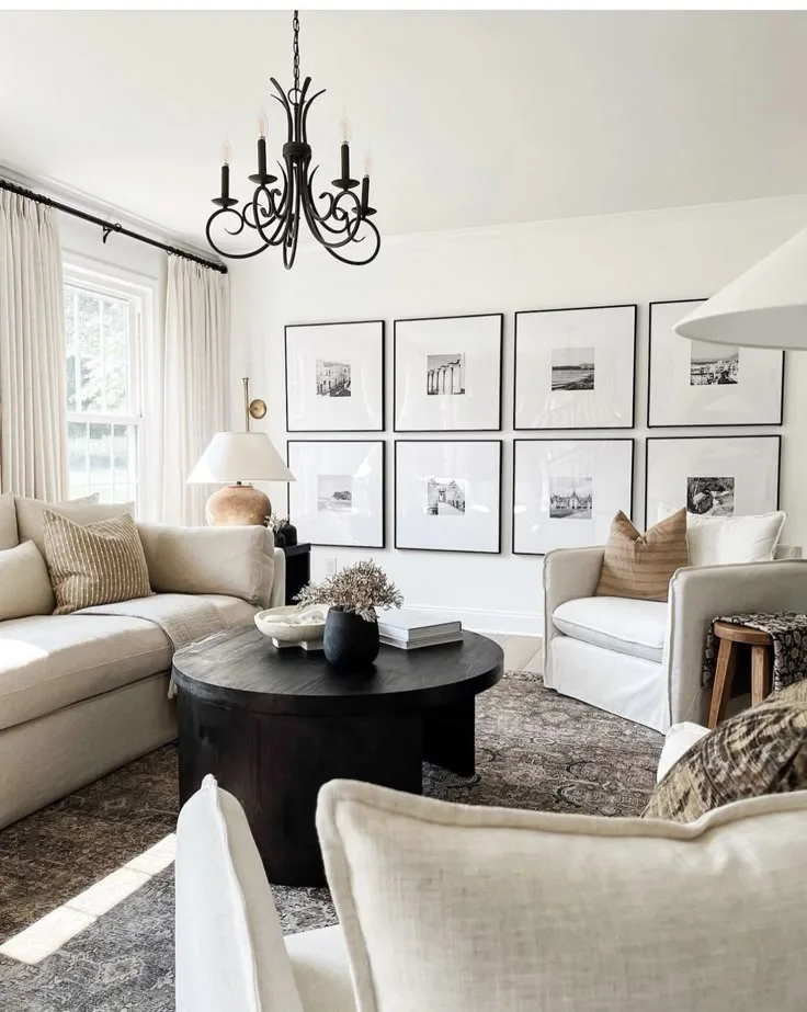
Image source: Bing (Web (fair-use with source credit))
Choosing the Right Frame, Mat, and Size for Your Wall
Frame selection is where the contrast either works for you or against you. There are three variables to settle: frame width, frame finish, and mat color and width. Get these right and the rest of the layout gets easier.
Frame width and finish: matte vs. satin vs. gloss
Frame width should scale with the art, not the wall alone. A thin 0.5-inch frame on a large 24×36 print looks weak. A wide 2-inch or 3-inch frame on a small 5×7 photo overwhelms it.
A rough rule: small art gets thin frames, large art gets medium to wide frames.
Finish changes how the black reads. Matte and satin finishes absorb light and look calm. Gloss finishes bounce light, which can create glare on the frame itself.
If your art sits near a window or under a directional lamp, matte or satin is the safer call.
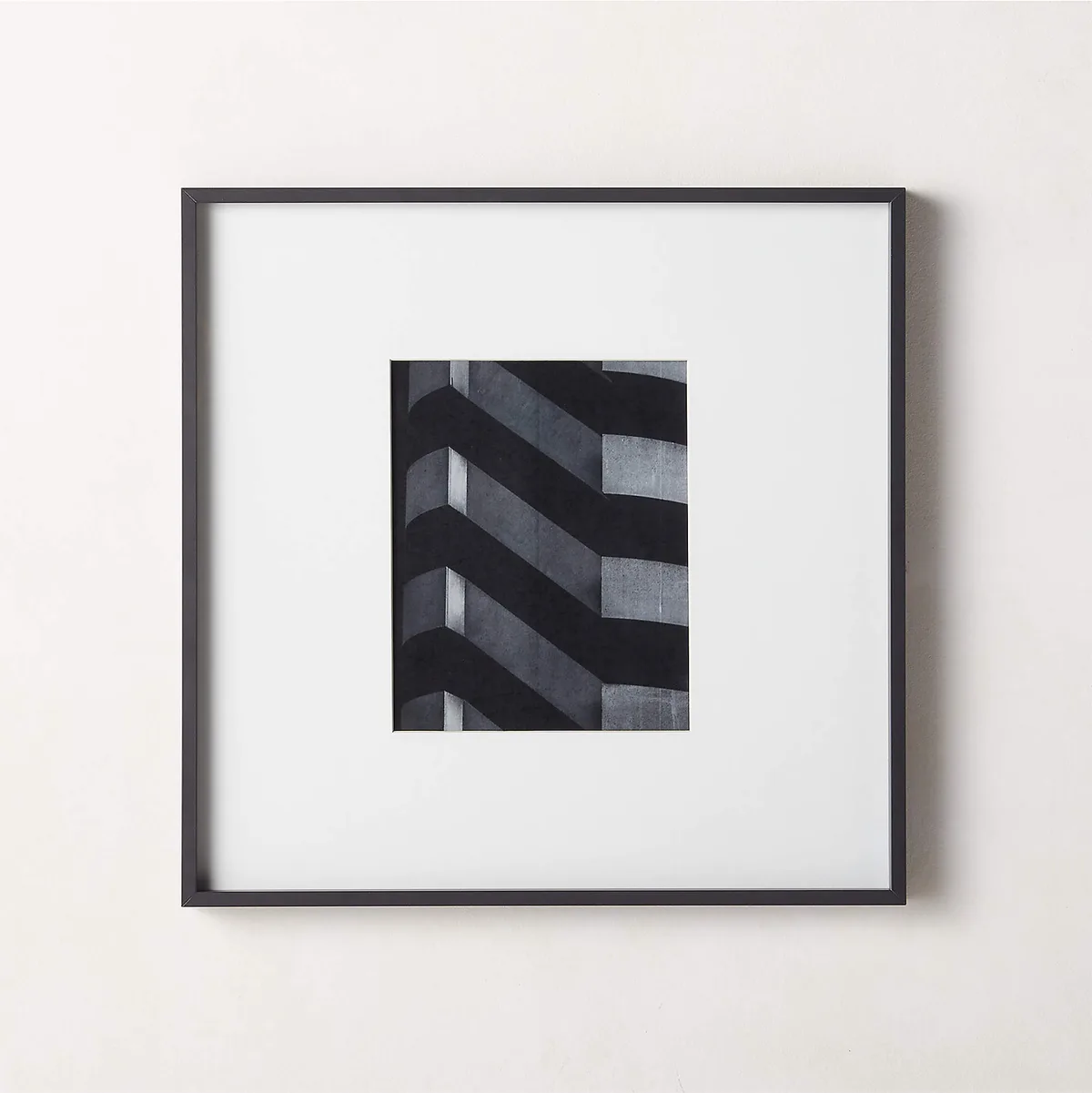
Image source: Bing (Web (fair-use with source credit))
Mat color and width, the make-or-break detail
This is the mistake we see most often. A cream or ivory mat on a stark white wall doesn't look warm. It looks dingy, because the eye compares it directly to the bright wall behind it.
Your options, laid out plainly:
- White mat: clean, bright, lets the black frame do the talking
- Off-white or cream mat: warmer, but risky against a pure white wall
- Black mat: bold, heavy, merges with the frame into one solid block
- No mat: works for large photos and canvases, less forgiving for small prints
Mat width typically runs 2 to 4 inches. Smaller art often needs a wider mat to gain presence. Photography and fine prints usually look best with a mat that's at least 2 inches on every side.
Matching frame scale to wall size and art size
A blank white wall is a big, bright surface. Small frames scattered across it tend to look lost. If the wall is large, group pieces into a gallery wall or go bigger with a single statement frame.
Manufacturer size charts give you the standard options to work from: 4×6, 5×7, 8×10, 11×14, 16×20, 18×24, and 24×36 inches. Pick the largest size the art and budget allow, then let the layout fill the wall.
Step-by-Step: Planning and Hanging a Black-Frame Gallery Wall
Good gallery walls are planned on paper before a single nail goes in. The photo below shows a common mistake: frames that look fine individually but fight each other when grouped. Sketching first avoids that entirely.

Image source: Bing (Web (fair-use with source credit))
Sketching and templating your layout
Start on the floor or with kraft paper. Cut paper templates for each frame at its real size. Tape them to the wall and step back.
This lets you move pieces around without making holes.
Work from a center point. Symmetrical grids use matching frame sizes and even spaces. Salon-style walls mix sizes and rely on a steady 2 to 3 inch gap between every piece.
Once the templates look right, mark the hanging points with painter's tape.
Standard spacing and hanging height
Here's the number that matters most. Hang art so the center of the piece sits 57 to 60 inches from the floor. The Smithsonian and most gallery display standards use this range.
It matches average eye level, so the art meets you where you stand.
For gallery walls, keep the gap between frames at 2 to 3 inches. Consistent gaps read as intentional. Uneven gaps read as an accident.
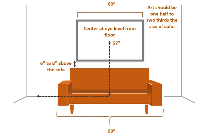
Image source: Bing (Web (fair-use with source credit))
Hardware choices and damage-free options
- D-rings and wire: the standard for most wood frames, easy to adjust
- Sawtooth hangers: fine for small, light frames only
- French cleats: best for large or heavy pieces, holds them flush to the wall
- Adhesive strips: good for renters and light frames, rated by weight on the pack
- Drywall anchors: needed when you can't hit a stud
Check the weight rating on the hardware and the frame. A 24×36 frame with glass can weigh 10 pounds or more. That's cleat or stud territory, not a sawtooth.
Black Frames vs. White, Wood, and Metal Side-by-Side
Black isn't the only choice, and knowing when to skip it saves you a repaint. Here's how the main options compare on a white wall.
| Frame option | Look on white walls | Best for | Watch out for |
|---|---|---|---|
| Black | Bold, high contrast, art-forward | Photography, line art, mixed gallery walls | Shows every proportion mistake |
| White | Soft, blends into the wall | Airy, minimalist, light-filled rooms | Art can look like it's floating loose |
| Natural wood | Warm, textured, mid-tone | Mid-century, Scandinavian, earthy schemes | Grain can clash with busy art |
| Metal (brass, steel) | Sleek, reflective, modern | Contemporary and industrial interiors | Reflections can distract from the art |
Black wins when you want the art to be the star. White wins when you want the wall to feel calm and quiet. Wood adds warmth a black frame can't.
Metal adds shine, which can be a help or a nuisance depending on your lighting.
Common Mistakes That Make Black Frames Look Cheap or Harsh
A black frame amplifies whatever's inside it, so small errors show up loud. The most common offender is proportion. A hair-thin 0.5-inch frame on a large 24×36 print reads as flimsy, not minimal.
Wide moulding on tiny art has the opposite problem: the frame eats the picture.
Cream and ivory mats are the second big trap. Against a stark white wall, warm-toned mats turn muddy by comparison. Stick to a true white mat or commit to a full black mat, which merges cleanly with the frame.
Overcrowding kills a gallery wall fast. Too many small frames in one tight cluster turn into visual noise. Fewer, larger pieces with steady 2 to 3 inch gaps always read better.
Then there's height. Hanging art too high is the classic first-timer move. Anything above that 57 to 60 inch center line floats away from the room.
Finally, ignore lighting at your own risk. Gloss frames and standard glass throw glare under direct light, so matte finishes and anti-glare glass solve most of it.
Best Rooms and Use Cases for Black Frames on White Walls
Black frames behave differently from room to room, mostly because of light and wall scale. Match the setup to the space and you'll get more from the contrast.
Living rooms, hallways, bedrooms, offices
Living rooms handle bold statements well. A single large black frame over a sofa, centered at eye level, anchors the seating area. Hallways suit tight salon-style groupings, since you view them up close and in passing.
Bedrooms favor softer arrangements. A few small to medium frames in a loose grid keep things calm. In offices, black frames on white walls read as professional and let photography or typography carry the tone.
Rentals, small apartments, and open-plan homes
Renters should lean on adhesive strips rated for the frame's weight. They avoid nail holes and repainting at move-out, which matters when a deposit is on the line.
Small apartments need every wall to earn its space. A floor-to-ceiling gallery wall turns a narrow blank surface into storage-free décor. Open-plan homes have large, tall walls, so undersized frames get lost.
Go oversized here, or group several medium pieces into one big composition.
Maintenance, Lighting, and Long-Term Care
A black-frame wall is low maintenance, but a few habits keep it looking sharp for years. Most of the care is about controlling light and humidity, not scrubbing frames.
Humidity, fading, and frame warping
Wood frames absorb moisture, and that's their weak point. In bathrooms and coastal homes, humidity makes frames warp and joints separate. Paper art fades fastest under direct sunlight and UV exposure.
The American Institute for Conservation recommends UV-filtering glazing and keeping art out of direct sun for anything valuable. If a room stays humid, keep the art elsewhere or use a sealed frame with acrylic glazing.
Cleaning glass and rotating art
Dust frames with a dry microfiber cloth, never a wet rag on wood. Clean glass with a spray applied to the cloth, not the surface, so liquid never seeps behind the frame.
Rotating art every season keeps the wall fresh and spreads sun exposure across pieces. It also lets you test new arrangements before committing. When you do swap things out, patch and repaint nail holes right away so touch-ups match before the paint cures to a slightly different shade.
Frequently Asked Questions
What size frame looks best on a white wall?
Scale the frame to the art first, then the wall. Small art (5×7 to 8×10) suits thin frames, while larger prints (16×20 and up) need medium to wide moulding. On a big blank wall, a single oversized frame or a grouped gallery wall beats scattered small pieces.
Should I use a mat with black frames on white walls?
Yes, in most cases. A 2 to 4 inch white mat separates the art from the black frame and gives small prints more presence. Skip the mat only for large photos or canvases, where the frame can stand alone without looking cramped.
How high should I hang black frames?
Center the artwork 57 to 60 inches from the floor. This matches the museum and gallery standard and average eye level, so the art meets you where you stand. Above furniture, leave 6 to 8 inches between the frame bottom and the sofa or console.
Do black frames work in small rooms?
They work well, as long as the layout is deliberate. A single column of frames or a tight grid keeps a small wall from feeling cluttered. Use adhesive strips in rentals, and keep gaps consistent at 2 to 3 inches so the group reads as one piece.
Why do my black frames look harsh?
Usually it's proportion or finish. Overly thin frames, glossy surfaces, and cramped spacing all make black read as severe rather than sharp. Switch to matte or satin finishes, give each piece breathing room, and add a white mat to soften the contrast.
How do I stop glare on black frames under light?
Glare comes from shiny surfaces reflecting light sources. Choose matte or satin frames over gloss, and upgrade to anti-glare or UV-filtering glass. Position the art away from direct lamp angles, and avoid hanging directly opposite windows that throw strong daytime reflections.

Similar Posts