Mail Sorter as Decor: Stylish Organizer Ideas
Done.
A mail sorter as decor is exactly what it sounds like: a vintage or industrial letter organizer used as a styling piece instead of a filing tool. In our research, the ones that work best share three traits: real metal or solid wood, a patina that reads "collected" rather than "bought last week," and a scale that matches the wall or counter it sits on.
Manufacturer specs on reproduction sorters typically list 12 to 24 inches wide and 3 to 5 inches deep per slot. True antiques run heavier, often 4 to 8 pounds, which matters once you start thinking about wall anchors. Here's how to pick one, style it, and keep it looking intentional instead of cluttered.
mail sorter as decor
A mail sorter as decor works when the piece reads as sculpture, not storage. Choose real metal or solid wood over pressed board. Match the finish to your room's existing palette.
Keep at least half the slots empty. Anchor wall-mounted units into studs or with toggle bolts.
Why a Vintage Mail Sorter Is the Easiest Décor Upgrade You're Not Using Yet
Entryway tables get styled with the same three things: a tray, a candle, a plant. That's fine, but it's also forgettable. A mail sorter brings vertical structure, texture, and a story to a space that most décor pieces can't fake.
The appeal is simple. These objects were made to be looked at every day. Postal clerks and office workers stared into them for decades, which is why the proportions feel balanced and the detailing holds up close.
Grouping matters more than the piece itself. A single sorter on a bare console looks stranded. Pair it with two or three objects at different heights, and it anchors the whole arrangement.
In our review of vintage resale listings, metal sorters move fastest in the $25 to $120 range. Anything under $15 is usually dented, rusted, or missing hardware. Anything over $200 needs provenance to justify the price.
What Actually Makes a Mail Sorter Work as Décor
Three things separate a sorter that looks styled from one that looks like leftover office furniture. Proportion, finish, and negative space. Get those right and almost any sorter works.
Proportion is about the wall or surface it lives on. A 24-inch sorter on a 36-inch console overwhelms it. On a 60-inch sideboard, that same piece looks balanced.
Finish is about honesty. Raw steel, aged brass, and oiled walnut all read as intentional. Shiny chrome and matte plastic read as cubicle.
If the finish fights the room, it wins, and not in a good way.
Negative space is the one people miss. A sorter stuffed with envelopes and receipts looks like clutter in a frame. Empty slots create rhythm, and rhythm is what makes the eye linger.
What should you look for first?
Look at the material first, then the finish, then the slot count. Material tells you how it'll age. Finish tells you whether it fits the room.
Slot count tells you whether it'll look busy.
Material decides everything downstream. Steel and tin develop character. Pressed wood and acrylic don't.
They just get scratched.
Metal vs. Wood vs. Acrylic: Reading the Finish Before You Buy
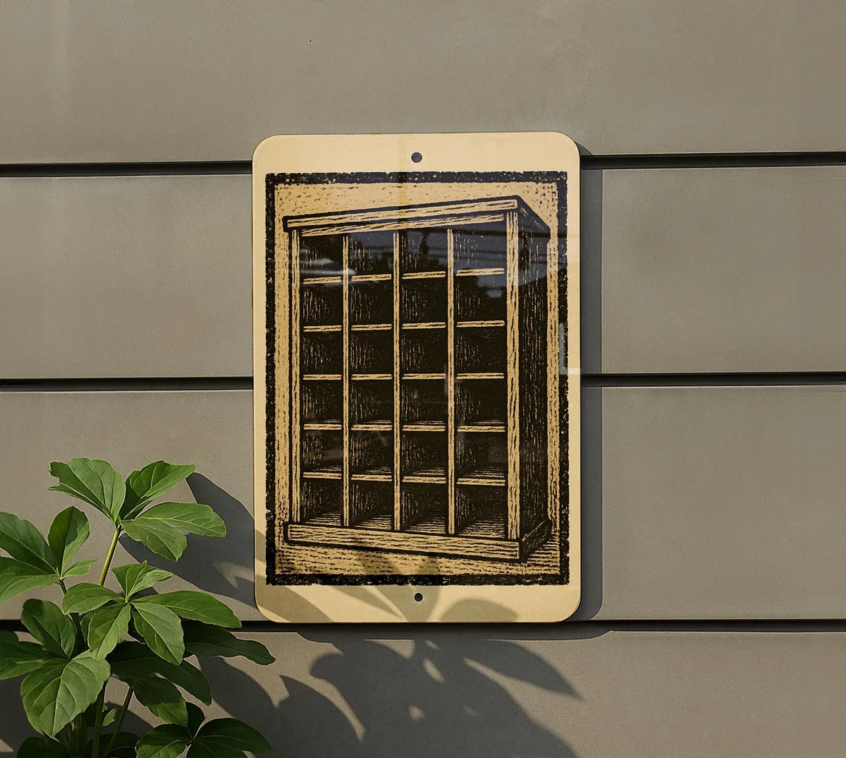
Image source: Bing (Web (fair-use with source credit))
Each material sends a different signal, and the signal matters more than the material's durability. Here's how they compare.
| Material | Best For | Watch Out For | Typical Price |
|---|---|---|---|
| Steel / tin | Industrial, farmhouse, eclectic | Rust, sharp edges, lead paint | $15 to $150 |
| Solid wood | Mid-century, cottage, warm modern | Cracking, water rings, loose joints | $20 to $200 |
| Pressed board / MDF | Budget starter pieces | Delamination, chipped veneer | $10 to $40 |
| Acrylic | Modern, kids' rooms | Yellowing, visible scratches | $12 to $35 |
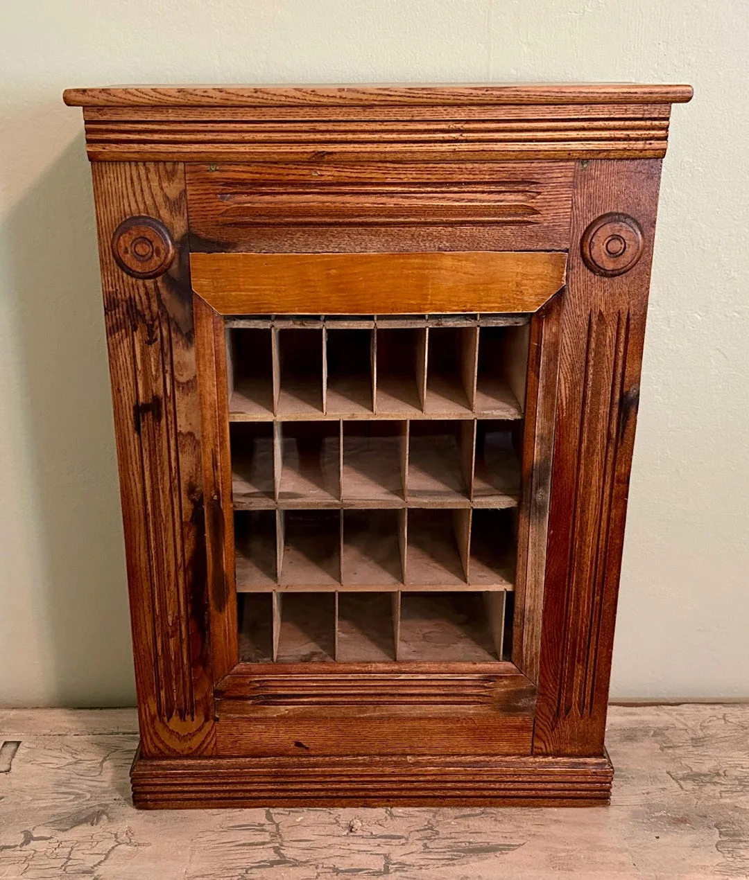
Image source: Web (Bing) / etsy.com (Web image (fair-use with source credit))
Steel is the classic. A pigeonhole shelf in aged tin has that worn, honest look that's hard to replicate. Just test for lead paint on anything pre-1978, and check the slot edges for burrs before you hang it.
Wood reads softer and warmer. Mid-century teak and walnut sorters slot into living rooms and home offices without a fight. Farmhouse pieces in chippy white or faded green work in kitchens and mudrooms.
Acrylic is the wildcard. It's cheap, light, and great in kids' rooms or craft corners. It just won't fool anyone into thinking it's vintage.
The Patina Test: What to Keep, What to Strip
Keep original patina unless it's actively flaking or unsafe. That's the short version. A stable, dark, even finish is worth more and looks better than a fresh coat of spray paint.
Strip only when the finish is chalking, peeling, or testing positive for lead. In those cases, you're not restoring, you're making it safe. Different job, different approach.
If you're unsure, wipe a small area with a damp cloth. If pigment comes off on the rag, the finish is unstable. That's your cue to seal or strip.
Where It Belongs: Entryway, Office, Kitchen, and the Rooms Nobody Expects
Most people put a sorter in the entryway and stop there. That's a waste of a good object. These things work in at least five rooms, and each one asks something different of the styling.
- Entryway: the obvious pick. Wall-mounted, above a bench or console, with keys and a single plant on the shelf below.
- Home office: tabletop works here. Lean it against a stack of books, keep one slot with pens, leave the rest open.
- Kitchen: a small wooden or enamel sorter as a command center. Coupons, takeout menus, grocery receipts. Functional and styled.
- Bathroom: hair tools and brushes in a narrow sorter on the vanity. Enamel or sealed wood only.
- Kids' room: a cheap acrylic or painted wood piece for art supplies and small toys.
The unexpected rooms are where it earns its keep. A bathroom sorter reads deliberate. An entryway sorter reads expected.
Same object, different effect.
Wall-Mounted vs. Tabletop: Sizing the Piece to the Space
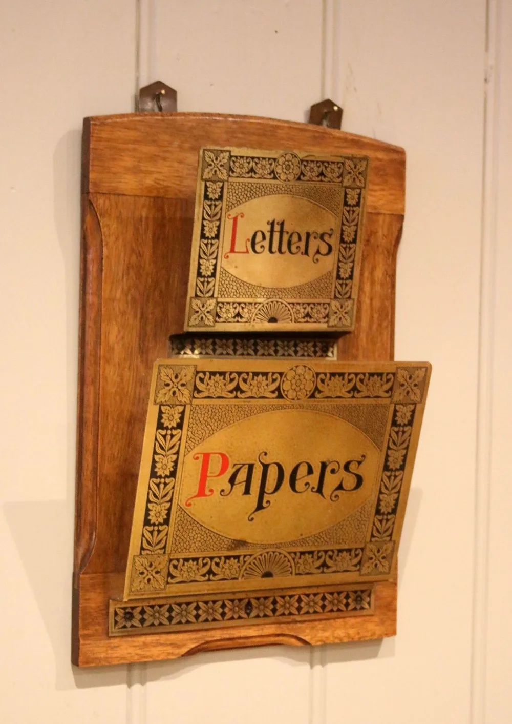
Image source: Bing (Web (fair-use with source credit))
This is the decision that trips people up most. Wall-mounted opens up floor and counter space. Tabletop gives you flexibility and zero install work.
Both are valid, and the right answer depends entirely on your room.
Wall-Mounted vs. Tabletop: Which Fits Your Space
If you're short on surface area, go wall-mounted. If you're short on wall space or renting, go tabletop. If you're styling a rental and want zero holes, tabletop wins every time.
Wall-mounted sorters need real anchoring. A loaded 8-pound metal sorter plus contents can easily hit 15 pounds. Drywall anchors alone won't hold that reliably.
Use a stud finder or toggle bolts rated for at least 25 pounds.
Tabletop sorters just sit there, which is their whole advantage. No tools, no damage, no commitment. The trade-off is surface footprint, usually 12 to 24 inches wide and 3 to 5 inches deep.
Height matters too. Wall-mounted pieces look best when the bottom edge sits 48 to 60 inches from the floor. That's roughly eye level for a standing adult.
Anything lower and it competes with furniture.
Styling the Slots: Negative Space, Height, and What Not to Fill Them With
The single biggest styling mistake is treating the sorter like it's still a filing system. Fill every slot and you get clutter in a frame. Leave most of them open and the piece breathes.
Our rule of thumb: never fill more than a third of the slots. If your sorter has twelve compartments, three things live in it. The rest stay empty, and that emptiness is what makes the piece read as décor.
Vary height across the filled slots. A tall dried stem in one section, a small ceramic dish in another, a stack of vintage postcards leaning in a third. Flat rows of identical items kill the effect.
Group the sorter with two or three companions at different heights. A stack of books underneath, a plant beside it, a framed print above. The sorter anchors the cluster, it doesn't carry it alone.
What should actually go in the slots?
Use objects that support the room's palette, not its function. Dried botanicals, small candles, matchboxes, a folded linen, vintage keys, a single ceramic vase. Skip envelopes, bills, and receipts.
That's the whole point.
Common Mistakes That Make a Mail Sorter Look Like Office Junk
Most mail sorters fail as décor for one of five reasons. All of them are fixable, and most cost nothing to correct.
- Overfilling it. The number one killer. An overstuffed sorter looks like a to-do list, not a design choice.
- Ignoring scale. A tiny six-slot sorter on a huge blank wall disappears. A 36-slot monster on a narrow console crushes it.
- Mixing finishes carelessly. Chrome next to oil-rubbed bronze next to raw steel reads messy, not eclectic.
- Leaving factory labels on. Barcode stickers and "Made in China" tags scream "I just unpacked this."
- Hanging it too high. Wall-mounted sorters placed above 60 inches float disconnected from everything below.
Fresh reproductions are the sneaky one. A brand-new pressed-steel sorter with perfect paint and zero wear looks like what it is. Age it honestly or commit to a vintage piece.
Can a reproduction ever work?
Yes, if it's styled carefully. Group a repro with genuinely old objects so the eye doesn't fixate on it. The newer piece borrows credibility from its neighbors.
Cleaning, Sealing, and Painting Without Ruining the Piece
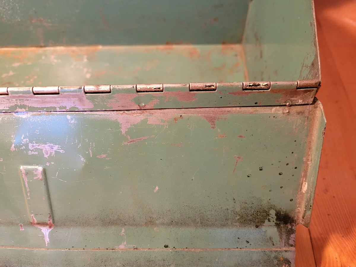
Image source: Bing (Web (fair-use with source credit))
Clean first, decide second. A soft brush and a damp cloth remove decades of dust without touching the finish. That's often all a piece needs.
If rust is present, hit it with fine steel wool and a light oil. That stabilizes the surface without stripping the character. For heavier rust, a vinegar soak works, but it will dull the metal.
Sealing is optional but smart. A matte wax or clear sealer locks in the patina and stops dust from settling into the crevices. It takes ten minutes and saves you a year of re-dusting.
Should you repaint a vintage sorter?
Only if the original finish is failing or unsafe. Repainting a stable antique destroys value. Repainting a chipped, lead-positive piece is a safety decision, not a style one.
If you do paint, match the era. Chalk paint and milk paint suit farmhouse and cottage looks. A matte spray enamel suits industrial pieces.
Glossy latex rarely suits either.
Follow EPA lead-safe renovation practices if the piece predates 1978. That means wet sanding, a respirator, and proper cleanup. It's not optional.
Lead Paint, Rust, and Wall Anchors: The Safety Stuff That Actually Matters
Vintage metal sorters are the highest-risk category here. Any piece painted before 1978 could carry lead, and chipping paint is the danger. A cheap lead test kit from a hardware store settles it in minutes.
Never sand or wire-brush a suspect finish dry. Dry sanding aerosolizes lead dust, which is the actual hazard. Wet methods, a respirator rated for particulates, and a plastic drop cloth underneath handle it safely.
Rust is a lesser concern, but sharp edges aren't. Run a cloth along the slot edges before hanging anything. A burr that snags fabric will snag skin, and it's easy to file smooth.
Wall anchoring is where most DIY installations fail. The OSHA general rule for overhead and wall-mounted items is simple: if it can fall, it can hurt someone. Use hardware rated for at least twice the loaded weight.
| Mounting Method | Safe Load | Best For |
|---|---|---|
| Adhesive strips | 1 to 4 lbs | Tiny acrylic sorters only |
| Plastic drywall anchors | 10 to 15 lbs | Light wood or small metal |
| Toggle bolts | 25 to 50 lbs | Full metal sorters, loaded |
| Into studs | 50 lbs+ | Heavy antiques, wall systems |

Similar Posts