Bauhaus Color Block Room Ideas That Transform Spaces
A bauhaus color block room is one of the few interior looks you can pull off with paint and tape alone, no structural work, no expensive materials, no specialist trades. It's also one of the easiest to get wrong. The difference between a room that looks like a design movement and one that looks like a toddler's playroom comes down to proportion, palette discipline, and edge quality.
In our research, most failed attempts share the same three mistakes: too many hues, no neutral anchor, and sloppy tape lines. Bauhaus principles map directly onto paint decisions, and the movement's own teaching materials still hold up today. A gallon of low-VOC matte emulsion covers roughly 350 to 400 square feet according to manufacturer technical data sheets, which makes an average room cost about $50 to $200 in paint.
Here's how to plan, paint, and get it right.
bauhaus color block room
A bauhaus color block room uses large flat planes of primary color, red, yellow, and blue, plus white, black, or grey. Purple? No.
Orange? Only as a secondary accent. Think of a wall as a geometric canvas divided into rectangles and squares.
Proportion matters more than the colors you pick.
What Bauhaus Color Blocking Actually Means (And Why It's Not Just "Primary Colors on a Wall")
Pick a bauhaus color block room and you're signing up to a specific design philosophy, not a paint trend. The Bauhaus movement, founded by Walter Gropius in Weimar in 1919, taught that form follows function. Color, in that framework, has a job.
It orientates, divides, and balances a space.
That's different from "bold accent wall" thinking, which is decoration for its own sake. Bauhaus color blocking treats every wall plane as part of a composition. Blocks aren't arbitrary.
They respond to the room's architecture.
If you want the deep dive on the thinking behind it, Johannes Itten's The Art of Color and Josef Albers's Interaction of Color are still the reference texts. Albers spent years proving colors shift based on what sits next to them. Same red reads warmer beside yellow and cooler beside blue.
That's simultaneous contrast, one of Itten's seven color contrasts.
Here's what that means in practice. You can't judge a paint swatch in isolation. You have to see it against its neighbours, in the room's actual light, before committing.
Three things separate a genuine Bauhaus room from a general color-blocked one:
- Planes, not patterns. Bauhaus uses solid flat color fields. No stripes for the sake of stripes.
- Primary palette discipline. True Bauhaus leans on red, yellow, and blue, held together by a neutral.
- Function carries the design. A color block might divide a living zone from a dining zone. It isn't decoration alone.
If you're in it just for pretty colors, that's fine. It's just not Bauhaus, and it won't have the same visual weight.
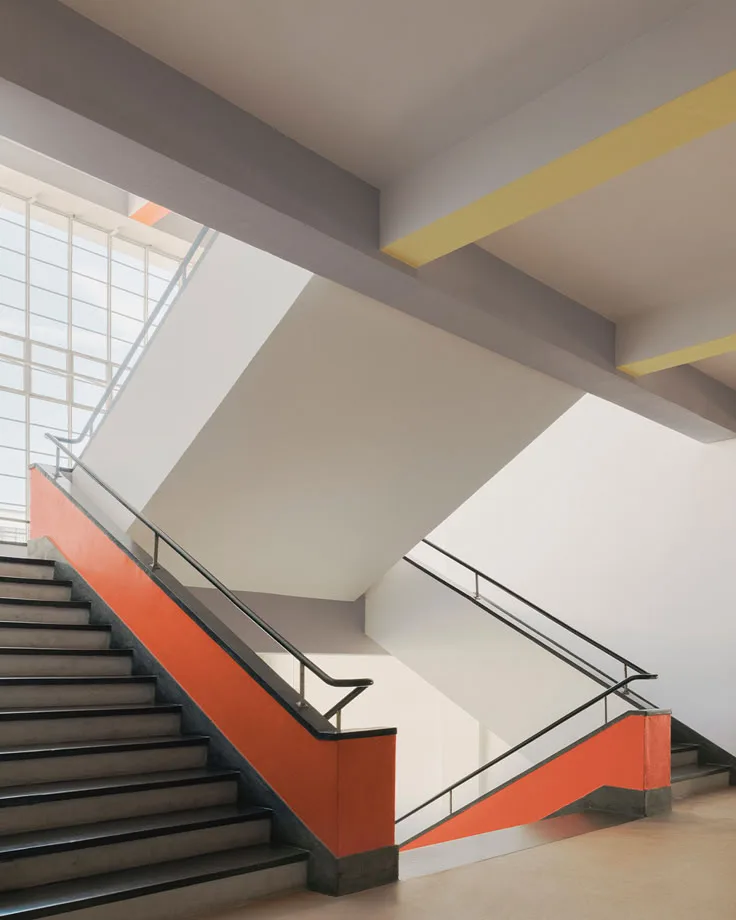
Image source: Bing (Web (fair-use with source credit))
The Visual Rules Behind a Real Bauhaus Room
This is where diagrams and photos matter more than words. Our image inventory shows a classic Bauhaus color-block wall, and you can read every rule off it in one glance. Each color sits in a clean geometric plane.
The blocks are weighted, not evenly split. And every edge is razor-sharp.
The three rules below apply to almost any Bauhaus-inspired scheme.
The Palette: Why It's Red, Yellow, Blue, and What Else You Need
Primary red, cadmium yellow, and ultramarine or primary blue are the anchor trio. That's non-negotiable. Any softening or shifting turns the palette into mid-century or Scandi.
Add a neutral. White is the classic choice, warm off-white works too. Black earns a place as a thin structural accent, usually in trim, a single line, or a small inset block.
Grey functions as a quieter alternative to white in rooms with less light.
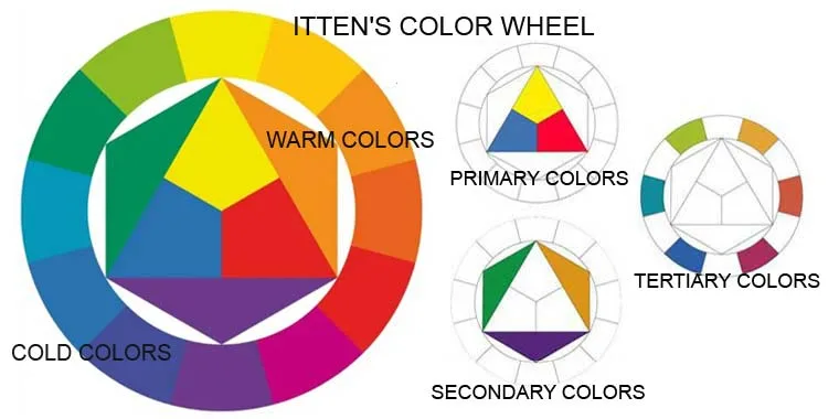
Image source: Bing (Web (fair-use with source credit))
Here's the discipline part. Three hues plus one neutral is the ceiling. Add a fourth or fifth hue and the composition collapses.
Most rooms that fail this test can trace the problem to one extra color too many.
Proportion and Weight: How Big Should Each Color Block Be
Odd ratios read as Bauhaus. Even ratios read as predictable. The movement's own compositions repeatedly used 1:1, 1:2, and 1:3 proportions, with one color taking dominance.
Practical ratios that work in real rooms:
- 60/30/10 split. One dominant hue, one secondary, one accent. This is the safest entry point.
- Two-thirds one color, one-third another. Strong, graphic, easy to live with.
- Full wall plus a small inset block. Bold but contained. Popular in entryways.
Set a floor on block size too. Nothing smaller than roughly 30 centimeters on its shortest edge, or it starts reading as a sticker rather than a plane.
Where the Lines Go: Planes, Not Stripes
Vertical splits work in narrow or tall rooms. They push the eye upward. Horizontal splits work in low-ceilinged rooms because they calm the vertical space.
Full-height color panels on one wall are the safest starting point. Half-height blocks split the room awkwardly unless you've planned furniture to sit against them. And wherever you place a block, no soft fade between two hues.
The edge is the edge.
Reading Your Room Before You Commit
Every decision up to this point changes once you're standing in your room. Light direction, ceiling height, and fixed surfaces dictate what works. Skip this step and even a perfect palette will disappoint.
Light Direction, Ceiling Height, and the Surfaces You Can't Move
North-facing rooms in the northern hemisphere receive cool, indirect light. Yellows go muddy. Blues get stronger.
In our analysis, this is the single biggest reason yellow-heavy schemes fail in certain rooms.
South-facing rooms get warm, direct light. Reds and yellows intensify, sometimes unpleasantly. Blues balance them out.
East-facing rooms are brightest in the morning, so daytime colors dominate. West-facing rooms peak at sunset, so evening colors dominate.
Then there are the immovables. Radiators, air conditioning units, structural beams, and windows dictate where planes can actually sit. You can't block around a radiator and expect it to disappear.
Either paint it into the scheme or design the block to incorporate it.
Ceiling height matters too. Low ceilings (around 2.4 meters or under) punish ceiling color blocks. Keep blocking on walls or floors in those rooms.
Small Rooms, Rented Rooms, Awkward Rooms, What Works Where
Small rooms benefit from color blocking more than almost any other space. A single vertical plane of color can fake depth. Two facing planes can visually widen a narrow room.
Rented rooms need a reversible approach. Peel-and-stick color blocks work for short-term tenants. Full paint-and-prep works for longer tenancies, but check your lease first.
Some landlords in the US and UK allow repainting if you return the walls to a neutral shade at move-out.
Awkward rooms, the ones with odd nooks or split levels, respond best to Bauhaus logic. Use color blocks to turn a structural oddity into a deliberate design feature. A boxed-in pipe becomes a small yellow plane if you commit to it.
How to Plan and Paint the Blocks (Step by Step)
Good Bauhaus blocking is 70 percent planning and 30 percent painting. Rushing the plan is the most common reason the finished room looks off. The steps below assume a single room, one weekend to plan, one to two weekends to paint.
Sketching the Layout and Locking the Palette
Start on paper, not in the paint aisle. Measure your walls. Include door and window positions on the sketch.
Then draw the block layout to scale.
Lock the palette before buying anything. Three hues plus a neutral, no exceptions. Write the exact product codes down.
Paint suppliers batch colors differently between orders, so buying a single larger tin per color avoids mismatch.
Buy tester pots. Paint 2 to 3 large swatches per color directly on the wall, not on board. Check them in morning, afternoon, and evening light.
Some colors shift dramatically throughout the day, and the wrong ones will read wrong in at least one of those windows.
Prep, Tape, and Crisp Edges: The Part That Makes or Breaks It
This is the make-or-break step. A Bauhaus color block depends on razor-sharp edges. Blurred edges read as sloppy, and no palette can rescue them.
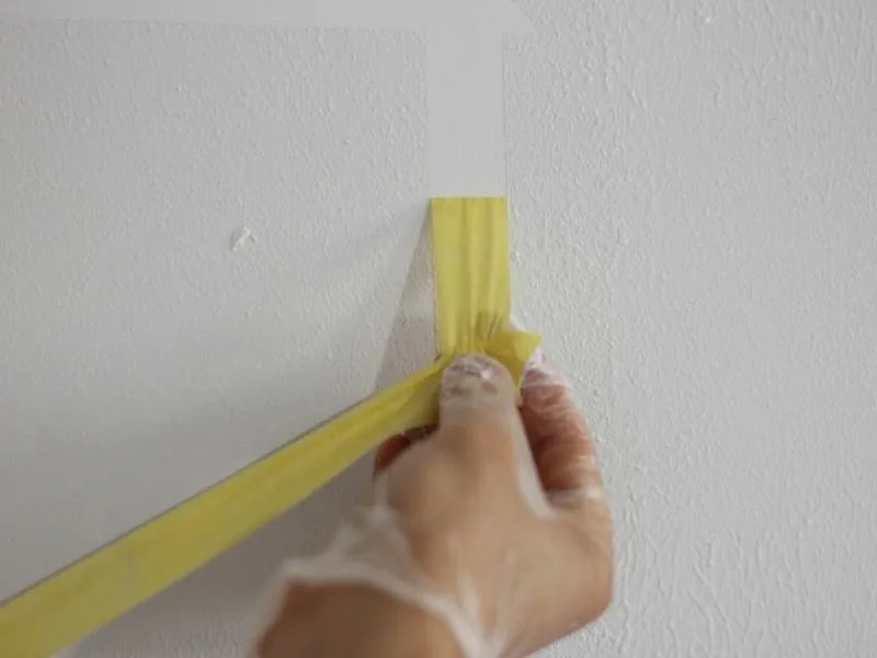
Image source: Bing (Web (fair-use with source credit))
Prep steps in order:
- Clean the wall. Sugar soap or a mild degreaser, then rinse. Dust and grease ruin adhesion.
- Fill and sand. Any imperfection shows up once color blocks cross it.
- Prime. Use a tinted primer for dark-over-light or light-over-dark swaps. Two tinted coats often beat three color coats.
- Tape with low-tack painter's tape. Laser-level your lines. Press edges firmly with a fingernail or a plastic edge tool.
- Cut in first. Brush a thin line along the tape edge, then roll the bulk of the plane.
- Two to three color coats. Saturated primaries over white usually need three. Let each coat dry 2 to 4 hours.
- Remove tape before full cure. Around 24 hours is typically the sweet spot for latex. Pulling too late risks peeling dried film.
A small tip that professional decorators rely on: seal the tape edge with a thin coat of the base color first. It bleeds under the tape rather than the top color, giving you a crisper line.
Repair, Repaint, and Renter-Friendly Alternatives
Bauhaus blocking is reversible. That's one of its quiet advantages. If you change your mind or move out, two coats of a neutral topcoat erase it.
Fill any nail holes or picture mounts, sand smooth, and spot-prime before repainting. If the block sits on a wall you're returning to white on a rental, match the landlord's original shade. A small tin is enough for touch-ups.
For renters who can't paint, peel-and-stick color blocks are a legitimate alternative. They don't match the texture of paint, but from a distance they read well. Just make sure the wall underneath is clean and the decals are removable without damage.
Test one in a hidden corner first.
Common Mistakes That Turn Bauhaus into Playroom
Too many hues is the fastest way to lose the Bauhaus look. Three primaries plus a neutral is the ceiling. Slip in orange, purple, pale pink, or a soft sage, and the room stops reading as Bauhaus.
Missing the neutral anchor comes a close second. Without white, grey, or black to hold the primaries down, every color fights every other color. It turns shouty fast.
Weak edge lines undo everything else. A sharp palette with fuzzy tape work still looks cheap. Verified decorator feedback repeatedly flags edge quality as the deciding factor between a professional finish and a DIY one.
Here are the other mistakes worth avoiding:
- Painting over architectural features without intent. Crown molding, dado rails, and skirting boards should be absorbed into a color plane or deliberately contrasted, not left in an awkward middle state.
- Blocking around immovable objects badly. A radiator painted in a block that stops dead above it looks accidental.
- Using trend colors instead of true primaries. Dusty ochre and terracotta belong to different movements.
- Skipping the tester pots. A red that reads warm in the tin can read almost burgundy on a north-facing wall.
- Underestimating coat count. Saturated yellow over white regularly needs three coats, not two.
- Ignoring the floor and ceiling. Bauhaus blocking works best when at least one horizontal plane echoes the scheme, even faintly.
If your room already has a busy patterned floor or heavily patterned rug, restrain the wall blocking. Two bold statements compete, and neither wins.
Bauhaus vs. De Stijl, Memphis, and Mid-Century: What's the Difference
Bauhaus uses solid color planes held together by proportion. De Stijl uses black lines as a grid and colors fill in between them. That's the simplest way to tell them apart, and it's the difference most people miss.
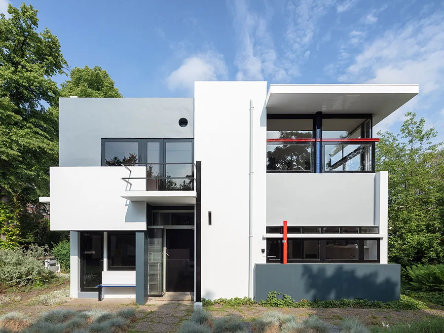
Image source: Bing (Web (fair-use with source credit))
Piet Mondrian's work is De Stijl. It's often called Bauhaus by mistake. Mondrian's grids are line-driven, and the black lines carry the composition.
Bauhaus blocking is plane-driven, and the color blocks themselves do the work.
Here's how the four movements compare on the details that actually matter for a room:
| Movement | Color palette | Composition logic | Best for |
|---|---|---|---|
| Bauhaus | Primary red, yellow, blue plus neutral | Weighted flat planes | Modern, mid-century, and loft rooms |
| De Stijl | Primaries plus black grid lines | Grid-based, line-driven | Graphic feature walls |
| Memphis Design | Pastels plus neon and black | Asymmetric, playful | Statement kids' rooms and studios |
| Mid-century modern | Warm woods, mustard, olive, teal | Furniture-led, softer tones | Family living rooms |
Memphis Design is the loudest of the four. It leans on pastel and neon clashes, asymmetry, and playful shapes from the 1980s Milan group. It's not Bauhaus, even though the two sometimes get lumped together.
Mid-century modern overlaps most with Bauhaus in spirit. It shares the geometric restraint and the functional focus, but it warms the palette with wood and softer hues. If your furniture leans walnut and teak, mid-century might be the better fit even if you love the Bauhaus look.
Costs, Coverage, and Timing: What to Actually Budget
A typical Bauhaus color block room costs about $50 to $200 in paint and materials. That's for an average room, mid-range paint, doing the work yourself. Tools add $30 to $80 if you don't already own them.
Coverage numbers are worth knowing before you buy. Manufacturer specs confirm that one gallon of latex paint covers roughly 350 to 400 square feet in a single coat. A standard 12 by 14 foot living room with an 8 foot ceiling has about 416 square feet of wall area, minus openings.
So you're looking at roughly 1.5 to 2 gallons total across all your colors.
Break that down by color and it's usually one gallon of the dominant hue, one tester or quart of each secondary, and a quart of the neutral. Buying a single larger tin per color avoids batch mismatch.
Timing runs longer than people expect. Plan for one weekend of prep and planning, then one to two weekends of painting. Each coat needs 2 to 4 hours to dry before recoating, per typical latex manufacturer technical data sheets.
Full cure takes 7 to 30 days, which matters if you're moving furniture back in.
Here's a rough budget table:
| Item | Typical cost | Notes |
|---|---|---|
| Paint (dominant hue, 1 gal) | $30-$60 | Mid-range matte emulsion |
| Paint (secondary hues, 2 quarts) | $20-$40 | Tester pots often suffice |
| Primer (tinted, 1 gal) | $25-$45 | Essential for dark-over-light |
| Low-tack painter's tape | $8-$15 | Delicate surface tape |
| Rollers, brushes, tray, laser level | $20-$40 | One-off tool cost |
| Total | $103-$200 | Materials only, DIY labour |
If you hire a decorative painter, expect $300 to $800 for a room depending on wall area and edge complexity. The labour is where the cost sits, not the paint.
Frequently Asked Questions
How long does a Bauhaus color block room take to paint?
Plan one weekend for planning and prep, then one to two weekends for painting. Each coat dries in 2 to 4 hours before you can recoat. Full cure takes 7 to 30 days.
The blocking itself is quick. The prep and edge work are what take the time.
Can you do Bauhaus color blocking in a rented apartment?
Yes, if your lease allows repainting or you use peel-and-stick alternatives. Full repainting is usually permitted if you return the walls to a neutral shade at move-out. Check your tenancy agreement first.
Peel-and-stick color blocks are a reversible option for short-term renters.
What colors belong in a Bauhaus color block room?
Primary red, yellow, and blue form the anchor trio. Add white, warm grey, or black as a neutral anchor. Three hues plus one neutral is the practical ceiling.
Anything beyond that dilutes the Bauhaus look into something more general.
Is Bauhaus the same as De Stijl?
No. Bauhaus uses solid color planes. De Stijl, associated with Piet Mondrian, uses black grid lines with colors filling the spaces between.
The two movements are related in time and spirit, but the composition logic is different. Bauhaus is plane-driven, De Stijl is line-driven.
Do you need a professional painter for Bauhaus color blocking?
Not usually. A competent DIYer with a laser level and low-tack tape can execute it. The skill lies in prep and edge work, not in the painting itself.
If your walls are in poor condition or you have awkward architecture, a decorative painter earns their fee.
Does Bauhaus color blocking work in small rooms?
Yes, often better than in large rooms. A single vertical color plane can fake depth. Two facing planes can make a narrow room feel wider.
Keep blocks large and let one color dominate. Tiny blocks in small rooms feel fussy.
What finish should you use for Bauhaus color blocking?
Matte or flat matte emulsion is the closest match to the Bauhaus aesthetic. Gloss finishes reflect light and break up the flat-plane reading. Use eggshell on trim only if a hard-wearing surface is needed.
The wall planes themselves should stay matte.

Similar Posts