Best Curtain Colors for Blue Walls: Stylish Ideas
Can't decide on a curtain color because of your blue walls? You're not stuck, you just haven't matched the variables yet. The right curtain color for blue walls depends on three things: your exact blue shade, its undertone, and how much light hits the room.
Get those wrong and even a "safe" cream can look muddy.
Most guides just hand you a list of colors. That's the problem. Per color wheel principles used across the design industry, blue sits opposite warm orange tones, so warm curtains balance cool walls.
In our research of manufacturer specs, the same slate-blue wall does well with camel and badly with cool gray. Here's how to pick your pairing.
What Color Curtains Go With Blue Walls? The Answer Depends on Your Blue
First, identify your blue. That one step decides everything else.
Blue walls come in four loose families, and each one pulls toward a different curtain palette. Navy and deep blues want warm contrast. Slate, denim, and dusty blues sit neutral and flexible.
Powder and sky blues stay airy, so they need gentle warmth, not more cool. Teal-leaning blues carry green, which changes the whole equation.
Second, check the undertone. Every blue leans warm, cool, or neutral. Cool blues (those with a gray or violet bite) demand warm curtains to stop the room feeling clinical.
Warm-leaning blues can carry cool neutrals without clashing.
Third, weigh the room's job. A bedroom wants calm and cocooning. A living room can handle bolder contrast.
An office usually wants clear, uncluttered light.
Get the sequence right and the color almost picks itself. Skip it and you'll buy three pairs before one works.
Quick Answer: The One Rule That Solves 80% of Blue-Wall Pairings
Match your curtain's undertone to your blue's undertone, then flip the temperature. That's the rule.
If your wall is cool blue, choose a warm curtain. Cream, camel, blush, or greige all work. If your wall runs warm blue, cool white, silver, or cool gray will settle it.
This tone-flip keeps the room balanced instead of one-note.
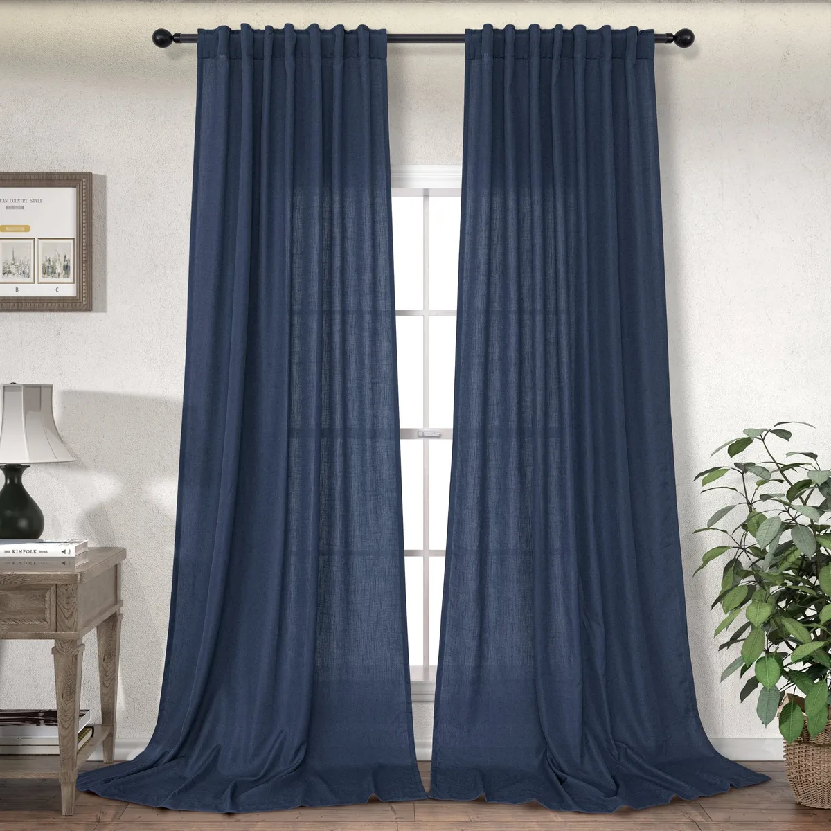
Image source: Bing (Web (fair-use with source credit))
The other 20% comes down to mood. Want drama? Go high-contrast.
Want calm? Layer tonal blues. Want airy?
Keep it light and sheer.
Undertone is the lever. Mood is the dial you turn after.
The First Variable: What Shade of Blue Are You Actually Working With?
Every curtain decision starts with the shade. "Blue" is a range, not a single color. Navy behaves nothing like powder blue.
Sort your wall into one of these four groups first.
Navy and Deep Blues
Navy is dark, saturated, and cool. It absorbs light, so the room can feel cave-like fast. The fix is warm contrast.
Cream, camel, mustard, and blush all lift navy without fighting it. Skip dark curtains here unless you want a deliberately moody, enclosed feel.
Slate, Denim, and Dusty Blue
These are the easy ones. Slate and dusty blue carry gray, which makes them nearly neutral. Almost any curtain color works: white, greige, warm gray, soft blue, even olive.
Denim blue leans slightly warm, so cool whites snap it into focus.
Powder, Sky, and Coastal Blues
Light blues feel airy and cool. The risk is making the whole room feel washed out. Warm whites, sand, and soft oatmeal add grounding.
Avoid pairing pale blue walls with pale blue curtains, because the two blur together.
Teal-Leaning and Blue-Green Walls
Teal carries green, so it changes the color math. Warm neutrals and crisp white both work. Be careful with pure yellow, because it can turn teal slightly acidic.
Camel and camel-adjacent tans are the safest warm anchors here.
The Second Variable: Undertones, Lighting, and Room Purpose
Warm Blue vs. Cool Blue Undertones
Warm blues lean toward violet or green. Cool blues lean toward gray or pure blue. Hold a white sheet of paper against the wall and compare them side by side.
If the wall looks grayer, it's cool. If it looks softer or greener, it's warm.
How Light Direction Changes Your Curtain Color
Light direction rewrites color. North-facing rooms get cool, even light all day. That exaggerates gray in blue walls.
South-facing rooms get warm, harsh light that intensifies blue. East windows glow warm in the morning. West windows dump hot orange light in the afternoon.
The practical rule: cooler rooms need warmer curtains. Warmer rooms can carry cooler curtains. Manufacturer specs confirm fabric reads differently under 2700K warm bulbs versus 4000K cool bulbs.
Matching the Palette to the Room's Job
A bedroom wants lower contrast and softer tones. Think tonal blues, oatmeal, or warm cream. A living room can take navy, charcoal, or a bold accent like rust.
A home office benefits from bright, clean neutrals that keep you alert.
Decision Branches: Curtain Colors That Work for Each Blue
Here's the if/then logic. Find your wall, then read the pairing.
| Your Blue Wall | Best Curtain Colors | Avoid |
|---|---|---|
| Navy | Cream, camel, blush, mustard, warm white | Dark navy, charcoal, black |
| Slate / dusty blue | White, greige, warm gray, soft olive | Muddy beige, cool gray |
| Powder / sky blue | Sand, warm white, oatmeal, soft tan | Pale blue, pale gray |
| Teal-leaning | Crisp white, camel, rust, warm neutral | Pure yellow, lime green |
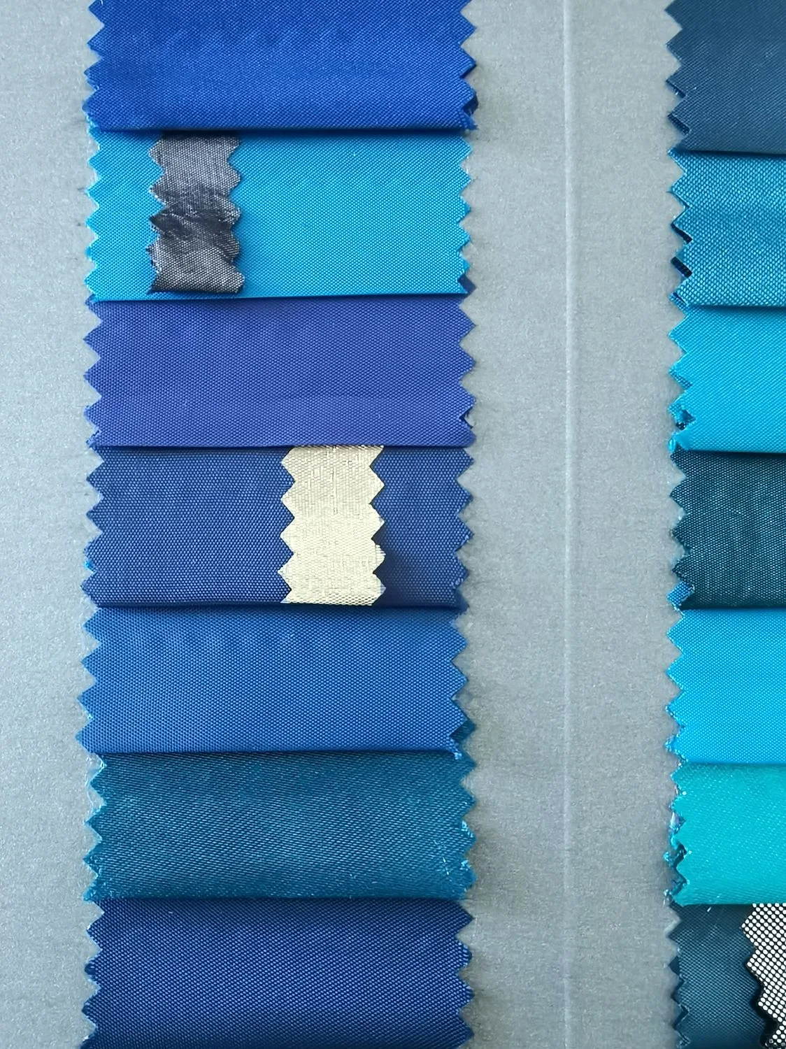
Image source: Bing (Web (fair-use with source credit))
Warm Neutrals: Cream, Camel, Blush, Greige
Warm neutrals are the universal rescue squad. They work with nearly every blue because they push back against coolness. Cream is the safest.
Camel and blush add a little depth. Greige sits between warm and cool so it rarely clashes.
Cool Neutrals: White, Silver, Cool Gray
Cool neutrals suit warm-leaning blues. Crisp white with powder blue is a classic coastal pairing. Silver and cool gray sharpen denim and slate.
Skip them against cool blues, or the room will feel flat and icy.
Tonal Blues: Monochromatic Layering
Tonal blues layer one blue on another. Navy walls with dusty blue curtains. Slate walls with pale blue sheers.
This look is calm and sophisticated. The trick is a clear difference in value, meaning lightness. Two blues at the same darkness disappear into each other.
High-Contrast Picks: Navy, Charcoal, Mustard, Jewel Tones
Contrast adds drama. Navy curtains against powder blue walls. Charcoal against sky blue.
Mustard and jewel tones like rust or emerald turn blue walls into a backdrop. This route works best in living rooms and dining rooms, not small bedrooms.
When to Reach for Texture or Pattern Instead of Color
Sometimes the fix isn't color at all. If you can't land on a hue, go neutral and add texture. Linen, bouclé, velvet, and slubby weaves add interest without color noise.
A subtle pattern can carry a second color and tie the whole room together.
Curtain Fabric, Weight, and Opacity: The Details That Change the Color
Fabric changes the color you see. Two curtains in the same "cream" can look completely different once they're hanging.
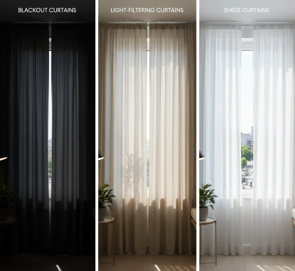
Image source: Bing (Web (fair-use with source credit))
Velvet absorbs light and reads deeper and richer. Silk and satin reflect light and read lighter. Linen and cotton sit in the middle with a soft, matte finish.
A blackout liner blocks light and can shift a curtain's shade by a noticeable amount, often making it look flatter.
Opacity matters too. Sheer curtains let the blue wall show through, which tints them. If you choose a sheer white against a strong blue wall, expect it to turn faintly blue when the light is behind it.
Room-darkening and blackout panels block that bleed but lose the airy look.
Weight affects drape and fullness. Heavier fabrics hang in soft, sculpted folds. Lighter fabrics float and ripple.
As a rule, aim for a fullness ratio of about 1.5x to 2x the rod width so the panels hang with some body.
Mistakes That Make Blue Walls Look Wrong
The most common mistake is skipping the swatch test. Buying curtains from a screen and hanging them straight away is how perfectly good color choices end up in a returns bin.
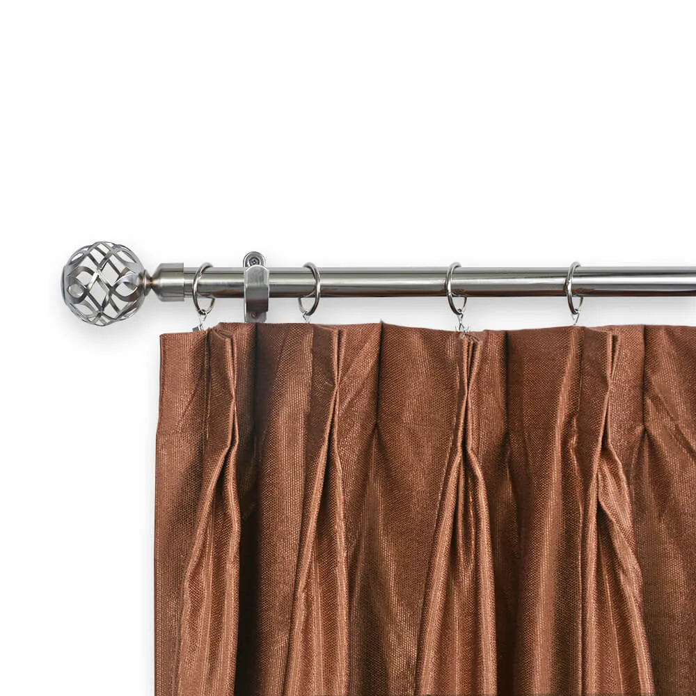
Image source: Bing (Web (fair-use with source credit))
Undertone Clashes You'll Notice But Can't Name
The room feels "off" and you can't say why. That's usually an undertone clash. A cool gray curtain against a warm blue wall is the classic culprit.
The two colors argue quietly instead of settling together.
Beige is the other trap. A yellow-based beige against cool blue can read sickly. Better to pick a clearly warm cream or a clearly cool white.
In-between tones are where trouble hides.
Same-Blue Curtains That Disappear Into the Wall
Blue curtains on blue walls work only when there's a clear difference in value. Two blues at the same darkness blur into one flat field. The wall stops looking intentional and starts looking like a painting mistake.
If you want tonal, push the curtain lighter or darker. Navy walls with pale blue sheers reads elegant. Slate walls with a mid-blue linen reads considered.
Same value reads accidental.
Choosing in Store Light, Regretting at Home
Store lighting lies. Retail spaces use bright, cool, high-Kelvin bulbs that wash out warm tones and flatten cool ones. A cream that looks fresh in the aisle can look yellow in your bedroom at 4pm.
Test swatches at home across morning, afternoon, and evening. Artificial light counts too. Manufacturer specs confirm fabric shifts under 2700K versus 4000K bulbs.
What you see at noon isn't what you see at 9pm.
Hardware and Pattern Distractions
Curtain hardware competes with curtain color. A shiny brass rod against a busy patterned panel plus blue walls is three focal points fighting. Pick one star per window.
Patterns multiply the risk. A busy print next to a strong wall color starts a visual argument. If your walls are saturated, go solid.
If the walls are pale, a bold pattern has room to breathe.
A Step-by-Step Workflow to Lock In Your Curtain Color
Here's the sequence we've found works. Run it in order and you'll skip most of the trial and error.
Identify your blue shade. Use a paper paint chip or smartphone color-scan. Sort it into navy, slate, powder, or teal. This narrows your curtain color list before you shop.
Check the undertone. Hold white paper against the wall and compare. Graver leans cool, greener or softer leans warm. That single read tells you whether to reach for warm or cool curtains.
Assess the light. Note the window direction. North and east rooms run cool and need warmer curtains. South and west rooms run warm and can carry cool neutrals.
Define the mood. Calm means low contrast and soft tones. Dramatic means high contrast (navy, charcoal, jewel tones). Airy means light neutrals and sheer layers.
Pick a color strategy. Choose one: warm neutral, cool neutral, tonal blue, or high contrast. Don't mix strategies in one window.
Order swatches. Get 3 to 5 fabric samples in paper or cloth. Hang them taped to the wall for two full days.
Check them in three lights. Morning, afternoon, and evening with lamps on. Eliminate any that shift muddy or clash.
Measure the rod. Rod should sit 4 to 6 inches above the frame, 3 to 6 inches wider each side. Panel width needs about 1.5x to 2.5x the rod width for good fullness.
Confirm opacity. Blackout for bedrooms, sheer for living rooms, semi-sheer for dining. Lined panels read richer and shift color less.
Hang and live with it. Give it three days. Natural light reveals what an hour of staring won't.
Curtain Color for Blue Walls: Frequently Asked Questions
What color curtains look best with navy walls?
Cream, camel, mustard, and blush work best. Navy is dark and cool, so warm curtains lift it and stop the room feeling cave-like. White also works if you want high contrast.
Skip dark navy or charcoal curtains unless you want a deliberately moody, enclosed feel.
Can I use blue curtains on blue walls?
Yes, if the two blues differ clearly in value. Navy walls with pale blue sheers reads layered. Slate walls with dusty blue linen reads considered.
Skip same-value blues, because they disappear into the wall and make the room feel flat.
What color curtains go with light blue bedroom walls?
Warm white, sand, oatmeal, and soft tan. Light blue walls already feel airy, so warm neutrals ground them without competing. Pale blue curtains are the one thing to avoid, because they blur into the wall and wash out the whole room.
Should curtains be lighter or darker than blue walls?
Lighter usually works better. Lighter curtains open up the room and create contrast against a strong wall. Darker curtains work only if you want a cocooning, dramatic feel.
Navy walls with charcoal panels can read luxurious, but it shrinks the space.
What colors should I avoid with blue walls?
Avoid muddy beige, cool gray against cool blue, and same-value blue curtains. Yellow-based beiges can look sickly next to cool blue. Pure yellow can turn teal walls acidic.
And any two blues at the same lightness will blur into a flat field.
Final Decision Guide: Match Your Blue to Your Curtain Color
Still torn? Run this three-line check.
If your wall is dark blue (navy), go warm. If it's medium blue (slate, denim, dusty), go either way. If it's light blue (powder, sky, coastal), go warm white or sand.
Between warm and cool, sample both. The swatch on the wall answers in 48 hours what a hundred images can't.

Similar Posts