Fireplace Tile Ideas for Colorful Walls That Wow
You've picked the lead surface, or you're stuck circling tile samples and paint chips that clash no matter how you arrange them. Pairing fireplace tile with colorful walls is one of those design problems where the fix isn't more options, it's knowing which surface leads. Get that order right and the rest falls into place.
Our research into installation standards and manufacturer guidance shows the core issue is undertone and finish matching, not the colors themselves. Per TCNA installation literature and paint industry specs, tile rated for heat exposure behaves very differently from wall paint under direct fireplace glow, and that gap shapes every decision you'll make. Let's start by figuring out which surface should lead.
fireplace tile with colorful walls
Pairing fireplace tile with colorful walls works when you let one surface lead. Pick the tile first, then choose wall color that shares its undertone and differs in finish. Matte tile next to satin paint reads calm.
Match the grout to the tile or the wall, never to nothing. Test both samples in the actual room under fireplace light.
Let the Tile or the Wall Lead — Pick Your Anchor First
Decide which surface leads before you buy anything. This single choice eliminates ninety percent of the color clashes people run into later.
If the tile has strong pattern, texture, or tone, the tile leads. Choose a quieter wall color that shares its undertone. If the wall has a saturated, deliberate color, the wall leads.
Choose a simpler tile with tight, minimal pattern. If neither has strong character, let accessories and lighting carry the energy.
When the tile should be the star
Patterned cement tile, glossy glass mosaic, and statement zellige want to be the focal point. Give them a wall color that reads as a backdrop, not a competitor.
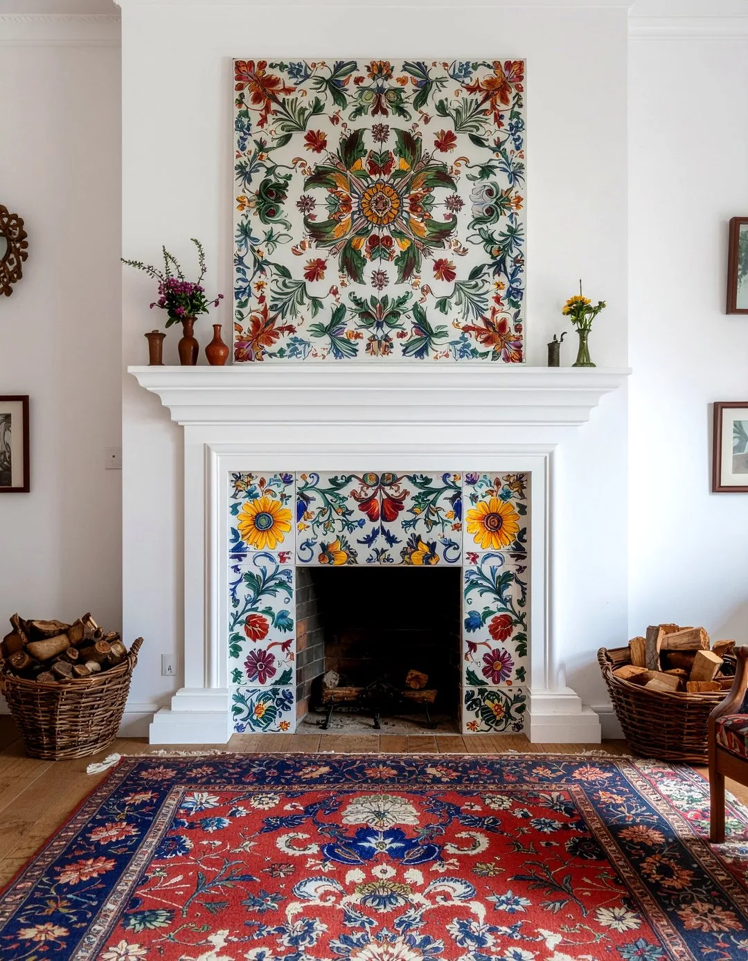
Image source: Bing (Web (fair-use with source credit))
When the colorful wall should carry the room
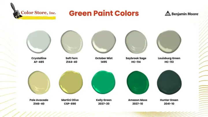
Deep greens, terracotta, and muted blues work best when the tile stays simple. A matte porcelain or honed natural stone in a tonal color lets the wall speak.
The third option: quiet tile, quiet wall, bold accessories
If you'd rather not commit hard to either, keep both surfaces muted and let mantel styling, artwork, and lighting do the talking. It's the easiest path to live with and the safest for resale.
The Visual Rules That Actually Matter
Color chips are a starting point, not a verdict. What matters is how the tile and the wall read side by side in your actual room.
Undertones decide compatibility. Warm tile next to cool paint clashes, even when the colors look fine in isolation. Warm-on-warm and cool-on-cool always sit easier.
Undertones: warm-on-warm, cool-on-cool, and the clashes to avoid
A terracotta tile has a warm orange base. A gray-blue wall has a cool base. Place them together and the wall makes the tile look dirty.
Match the family, then vary the depth.
Finish contrast: matte tile against satin paint (and when glossy works)
Contrast finishes for depth. Glossy tile against matte paint is dramatic. Glossy tile against glossy paint creates glare, especially under fireplace light.
Grout as a color decision — matching, contrasting, and in-between
Grout is a color choice, not a default. Match grout to tile for a seamless look. Contrast it for a graphic grid.
Never pick grout last.
How fireplace glow shifts your colors at night
Fireplaces throw warm, low light. Colors that looked balanced at noon can turn muddy by 8 PM. Always check samples with the fire lit.
Choosing Tile Materials for a Colorful Backdrop
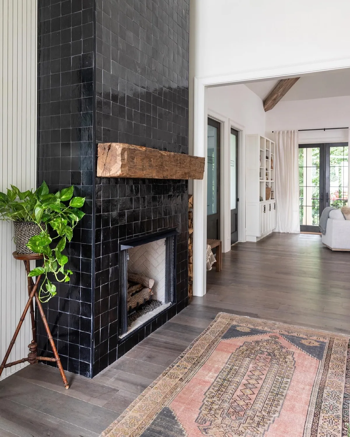
Image source: Bing (Web (fair-use with source credit))
| Tile Type | Best Paired With | Watch Out For |
|---|---|---|
| Zellige | Deep saturated walls | Uneven surface plus busy wall equals chaos |
| Matte porcelain | Nearly any color wall | Can look flat beside flat paint |
| Natural stone | Muted or tonal walls | Undertone surprises, needs sealing |
| Cement tile | Lighter walls, pattern leads | Can overpower saturated paint |
| Glass | Dark dramatic walls | Reflectivity doubles glare |
The Step-by-Step Process: Choosing Colors Like a Designer
- Identify fixed elements first: floor, trim, furniture. These constrain your palette before you pick anything new.
- Decide which surface leads, tile or wall.
- Pull tile samples and paint chips together, never separately.
- View both at three times of day, plus with the fireplace lit.
- Lock the grout color before you buy the tile.
- Paint a large swatch on the wall, not a small chip.
- Sequence the install: tile first, paint second, or repaint after for touch-ups.
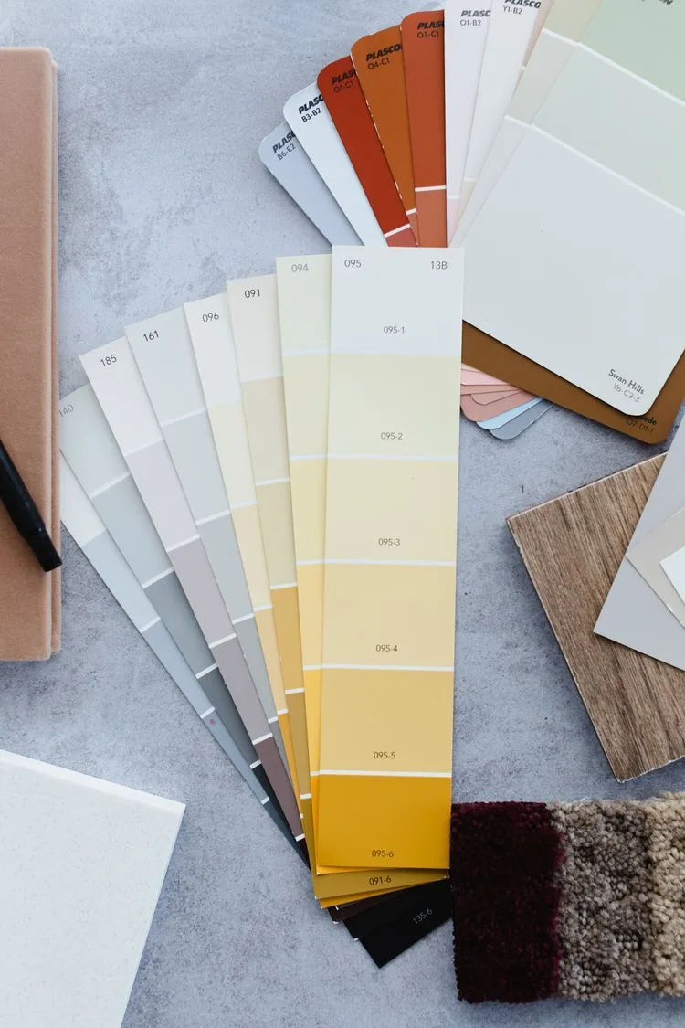
Image source: Bing (Web (fair-use with source credit))
Mistakes That Ruin the Pairing (and How to Avoid Them)
- Sampling tile in a showroom and paint in a different room. Colors only work together when viewed together.
- Ignoring undertones because chips looked fine side by side. Undertones win, every time.
- Choosing grout last. Grout is a design decision, not an afterthought.
- Painting a saturated wall next to a busy tile pattern. Two focal points fight each other.
- Skipping the evening-light test. Fireplace glow changes everything.
- Forgetting heat clearance and paint sheen near the firebox.
Cost, Resale, and Real-World Tradeoffs
Paint is the cheapest lever you have. A gallon of quality interior paint runs roughly $30 to $70 and covers 350 to 400 square feet per coat. Tile costs far more: budget ceramic sits around $2 to $5 per square foot, while zellige and natural stone climb past $15, before labor.
If you're flipping or planning to sell soon, keep the tile classic and put the color on the wall. Aggregate real estate feedback suggests buyers tolerate a bold painted wall they can repaint in a weekend. They rarely forgive an expensive tile they'll have to rip out.
If you're staying put for years, go deeper. This is your room, not a showroom. A saturated green wall behind handmade zellige is a decision you make once and enjoy daily.
When to call a designer versus DIY it
Paint is a solo job. Tile around a firebox involves substrate prep, heat clearance, and layout math. For a full surround or floor-to-ceiling work, bring in a tile setter.
Safety and Heat Clearance Worth Knowing
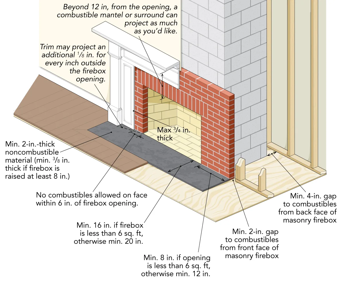
Image source: Bing (Web (fair-use with source credit))
Clearance to combustibles is non-negotiable. Combustible materials must stay a set distance from the firebox opening, per the appliance's listing label and local code. The distance varies by fireplace type, so check the manufacturer's documentation before you frame or tile.
Paint and finishes near an active fireplace need to tolerate heat. Standard interior paint can yellow or blister when it sits too close to the firebox. Verify the paint's heat rating and respect clearances.
Cure times before the first fire
Thinset, grout, and paint all need to cure before heat exposure. Manufacturer specs typically call for 24 to 72 hours before the first fire. Rush it and you risk cracking grout or off-gassing.
Vented versus ventless matters here
Ventless inserts run hotter on the face, so wall finishes near them face more stress. Vented fireplaces push more heat up and out. Match your finish choices to the appliance.
Frequently Asked Questions
Can I put colorful paint right next to a tiled fireplace surround?
Yes. Paint and tile coexist fine when clearances are met. Keep paint outside the combustible clearance zone, and choose a heat-tolerant sheen near the firebox.
Undertone matching still matters more than the color itself.
What grout color works with a bold wall?
Match the grout to the tile for a seamless, calm look. Or contrast it with the tile to make the grid a feature. Avoid matching grout to the wall unless you want the tile to visually dissolve.
Is zellige tile too busy for a saturated wall?
It depends on the wall. Zellige's uneven surface loves a solid, deep color with no pattern. A saturated but plain wall lets the tile shine.
Skip zellige against wallpaper or busy paint.
Should I tile the whole wall or just the surround if the wall is colorful?
Tile just the surround if the wall color is the star. Go floor-to-ceiling with tile only when the tile itself is the feature and the wall color plays a supporting role.
How do I test colors before committing?
Sample the tile and paint together in the room. View them at three times of day, plus with the fireplace lit. Lock the grout color before you buy.
Will bold paint hurt resale?
Rarely. Paint is inexpensive to change. Buyers weigh bold walls far less heavily than expensive, permanent tile choices.
Keep the tile classic and let paint carry the personality.
That's the whole guide. Let the tile or the wall lead, match undertones, contrast finishes, lock your grout early, and test everything under real light before you commit. Do that, and a fireplace tile with colorful walls stops being a risk and starts being the best-looking corner of the house.
Maintenance and Long-Term Care for Tile and Color
Grout is where maintenance lives. Sealed grout needs re-sealing every 12 to 18 months, especially around a firebox where heat cycles dry it out. Unsealed cement and natural-stone grout stains fast and looks tired within a couple of years.
Natural stone tile, including travertine and honed marble, needs periodic sealing too. Porcelain and glazed ceramic are the low-effort options, and most just need a damp cloth and a pH-neutral cleaner.
Cleaning without wrecking your finish
Skip abrasive powders on matte tile. They scratch the surface and dull the color. A soft cloth and warm water handle most soot smudges.
For glossy glass tile, use a streak-free glass cleaner.
Touching up painted walls near the firebox
Heat and smoke haze can dirty paint over time. Wipe walls in the clearance zone gently. Keep a small can of the exact wall color on hand.
Sunlight and fireplace glow fade paint unevenly, so touch-ups after a couple of years may need a full recoating.
Real Scenarios: How This Plays Out in Different Rooms
Here's what the pairing looks like in three common setups, with the decision logic behind each.
Small living room, deep green wall, simple matte tile
The wall leads because the room is tight. A saturated green wall wraps the space and adds depth that a neutral would flatten. Matte porcelain in a warm gray-beige lets the wall breathe.
Result: a cozy, intentional corner. Budget-friendly. Easy to repaint if tastes shift.
Open-plan great room, bold patterned cement tile, neutral wall
The tile leads here because it carries the design load across a huge visual span. A soft off-white wall would let the pattern speak. Matching grout to the tile keeps the surround reading as one block.
Result: a statement fireplace without color chaos. Best for homes that need a focal point in a big open space.
Period home, terracotta tile, muted blush wall
Both surfaces are warm-toned. A blush or clay-colored wall extends the terracotta's warmth without competing. Simple square tiles in a slightly deeper tone add subtle depth.
Result: warm and period-appropriate. Works in Victorian, craftsman, and Spanish-revival homes.
Expert Tips and Pro Advice
Three things separate a pairing that reads designed from one that reads off.
First, buy one extra tile as a paint reference. Take it to the paint store. Match undertones under their lighting before you commit to a gallon.
Second, commit to the grout before tile delivery. Changing grout later means tearing out the install.
Third, photograph your samples in the room at noon, dusk, and with the fireplace lit. The photos freeze the decision so you're not second-guessing color memory weeks later.
A note on lighting temperature
Warm-white bulbs (2700K to 3000K) flatter warm palettes. Cool-white bulbs (4000K and up) pull cool tones forward and can make warm tile look muddy. Match your bulb temperature to your tile's undertone.
Where to Verify Standards and Clearances
For fire safety, don't rely on forums or product blurbs. The National Fire Protection Association (NFPA) publishes clearance and installation guidance for solid-fuel and gas appliances. Your fireplace's listing label also carries the specific clearance numbers for your model.
Check NFPA for general fire-safety guidance. For tile installation standards, the Tile Council of North America (TCNA) publishes the Handbook that specifiers, installers, and inspectors cite. Manufacturer documentation from your tile, thinset, and paint brands should also be on hand.
Those three sources settle any argument about what's safe and what isn't.
Local building code always overrides general guidance. Pull the permit if your install touches the firebox or chimney.
A permit isn't red tape here. It triggers an inspection that catches clearance mistakes before they become a house fire. Most jurisdictions require one for any change to a fireplace surround or hearth, so check with your local building department before you buy tile.
One last point on materials near the firebox. Thinset mortar, backer board, and grout all need to be rated for the heat they'll see. Standard drywall and plywood behind tile near an active fireplace are a no.
Cement backer board is the minimum. For ventless inserts, the face runs hotter, so check the insert's own clearance diagram before you build anything.
That diagram is usually printed in the installation manual and often repeated on a metal tag inside the firebox or behind the surround. If you can't find it, call the manufacturer before framing. Guessing at clearances is how good-looking fireplaces turn dangerous.
Get those numbers, match your undertones, and lock your grout early. Everything else is paint and patience.
That's the whole playbook. Pick your lead surface, match undertones, contrast finishes, lock the grout before you buy tile, and test every sample under real light with the fire going. Do those five things and a fireplace tile with colorful walls becomes the corner of the house people ask about, not the one you quietly hope nobody notices.
Final Recommendation and Decision Guide
If your tile has pattern or texture, let the tile lead and keep the wall quiet. If your wall color is the bold move you want to live with, choose simple matte tile and let the color carry the room.
If neither needs to shout, mute both and let lighting and styling do the work. Match undertones warm to warm, cool to cool, and contrast finishes so the two surfaces read as layered instead of accidental.
Lock the grout before tile delivery. Test every sample under noon light, dusk light, and firelight. Respect clearance-to-combustibles numbers from the NFPA and your appliance's listing label, and pull a permit if the firebox or chimney is touched.
None of this requires a designer. It requires sequence. Lead surface first, undertone match second, grout third, samples tested in the real room last.
Get the order right and the colors take care of themselves.

Similar Posts