Stone Fireplace Palette: Colors That Work Beautifully
Choosing a palette for a stone fireplace isn't about picking colors you love. It's about reading what your stone already says, then building around it. Get that backwards and you'll fight the room for years.
Get it right and the fireplace anchors everything.
Here's what makes this tricky: the same beige paint can look warm next to one stone and dingy next to another. In our research, we've found that undertone clashes are the single biggest regret homeowners report after a fireplace remodel. So before you buy a single can of paint, you need to know which visual cues to look for.
Let's walk through it.
palette for stone fireplace
A palette for stone fireplace design pulls three colors from the stone itself. Use the dominant tone for the largest surfaces. Pull a secondary shade from the veining.
Let a third color appear only in mantel, hearth, or trim details.
Why Your Stone Fireplace Palette Is a Visual Decision, Not a Color-List Decision
Here's the thing nobody tells you upfront. There is no "correct" palette for a stone fireplace. There's only the palette that works with your specific stone, in your specific room, under your specific light.
Generic color lists fail because stone isn't uniform. A stacked ledgestone wall carries dozens of subtle color variations across its face. A honed limestone surround is far more consistent.
The palette that flatters one can easily flatten the other.
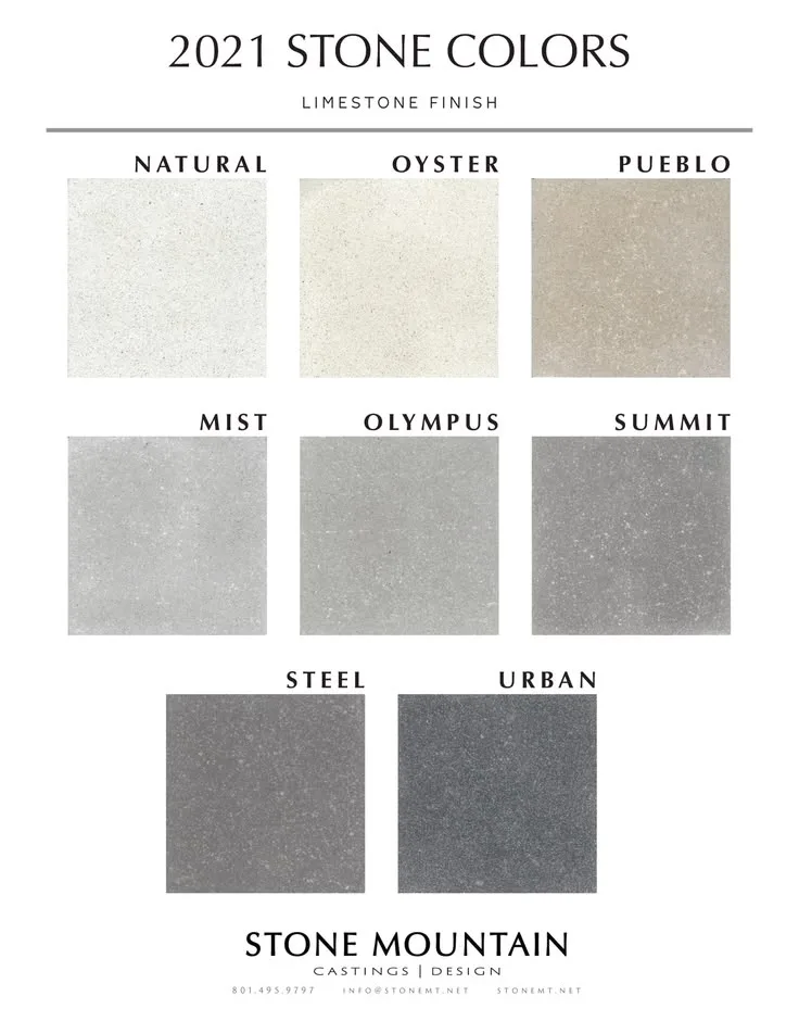
Image source: Bing (Web (fair-use with source credit))
This is why mood boards mislead people. A swatch card looks great in isolation. Then you tape it next to actual stone under a west-facing window at 5pm and it turns muddy or cold.
Visual context is everything here. You need to see the stone, the wall, the mantel, and the floor in the same frame. Ideally at multiple times of day.
That's not fussiness. That's the entire game.
So treat this as a visual matching exercise, not a shopping trip. The right approach: read the stone first, then build outward. Everything else follows from that.
Read the Stone First: The Visual Cues That Dictate Every Color You'll Choose
Every piece of stone contains a hidden recipe. Three colors, at most. Find them and you've got your palette skeleton.
Start by photographing your stone in natural daylight and again at night under your actual bulbs. In our research, viewing the same stone under different lighting repeatedly shifts which undertone dominates. That shift is real, and it matters more than any color wheel.
Dominant, Secondary, and Accent Colors Hiding in Your Stone
Most stone reads with a 60/30/10 split. Roughly 60% of the surface is one dominant hue. About 30% is a secondary shade in the veining or variation.
The last 10% is a faint accent you barely notice.
Here's how to spot them:
- Step back 6 to 8 feet and squint. The color that dominates when you blur your vision is your base.
- Look at the veins, streaks, or darker patches. That's usually your secondary.
- Hunt for the faint third tone, often a rust, gold, or blue-grey fleck. That's your accent.
If your stone shows more than three distinct colors, narrow it. A fireplace palette works best with three colors, four at the absolute most. More than that and the wall reads as noisy.
Warm vs. Cool Undertones — and How to Spot Them on Real Stone
Warm undertones lean yellow, red, orange, or brown. Cool undertones lean blue, green, grey, or violet. Neutral sits between them.
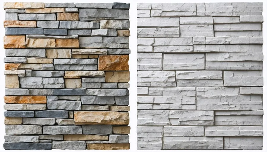
Image source: Bing (Web (fair-use with source credit))
How to tell them apart on real stone: hold a pure white sheet of paper against the stone. If the stone looks yellow or tan next to it, it's warm. If it looks grey or blue-ish, it's cool.
This one test saves more remodels than any paint app. If your stone is warm and you paint the walls a cool grey, both will look slightly wrong. The stone will read dingy.
The paint will read flat. Warm-on-warm or cool-on-cool almost always lands better.
How Texture, Finish, and Veining Change What Works Next to Your Stone
Texture changes how color behaves. Rough split-face stone absorbs light. Polished or honed stone bounces it.
The same paint can look brighter next to polished stone and darker next to rough stone.
Veining matters too. Heavy, dramatic veining wants a quieter backdrop. Subtle stone can handle a stronger wall color because there's less competition.
Manufacturer specifications for stone veneer typically list finish type (honed, tumbled, split-face, brushed) alongside color. Use both when planning, not just color.
The Four Elements You're Actually Coordinating
You're not choosing one color. You're balancing four fixed elements that all sit near each other forever. Miss one and the whole thing feels off.
Stone, Mortar, and Grout
Mortar and grout are the silent dealbreakers. A too-bright white grout on warm stone reads harsh. A charcoal grout on pale limestone reads heavy and dated.
Match or slightly complement your grout to the stone's secondary tone. That's the safe zone. Tight joints (around 3/8 inch on ledgestone, tighter on ashlar) hide grout visually, so color matters less.
Wide overgrout joints make it a design feature, so chose carefully.
Mantel and Hearth Materials
Your mantel is the boldest color decision after the stone itself. Wood, stone, concrete, and metal each shift the palette differently.
- Wood mantels add warmth. Reclaimed beams push a rustic read. Painted wood keeps it clean and modern.
- Stone mantels create a seamless, monochromatic look. They work best when they match the surround closely.
- Concrete and metal mantels cool the palette. They suit modern and industrial rooms.
- Hearth material ties the fireplace to the floor. Use it to connect the two zones.
Wall Paint and Trim
The wall behind and around the stone should support it, not compete. Two routes work: match the stone's undertone for a seamless look, or go intentionally contrasty for drama.
Trim is the quiet variable. It should almost always echo the mantel or the wall, never fight both. LRV, or Light Reflectance Value, tells you how much light a paint bounces.
A high-LRV paint next to a dark stone reads crisp. A low-LRV paint next to pale stone reads moody.
Floors, Furniture, and Fixed Wood Tones
Floors are permanent. If your floors are warm oak, your stone and wall should lean warm too, or the room splits in two. Furniture and textiles are movable, so they matter least.
Set the fixed palette first, then layer the flexible stuff on.
Swatch Testing That Actually Predicts the Final Result
This is where most people cut corners, and it's where most regrets are born. Testing is not optional. It's the difference between a confident finish and a costly redo.
Taping Samples Against the Stone (Not the Wall)
The cardinal rule: tape your samples directly against the stone. Not on a nearby wall. Not on the floor.
Against the stone.
Why it matters: your eye reads color in relation to its neighbor. A swatch on a blank wall tells you almost nothing. A swatch touching the actual stone tells you the truth.
Do this with paint chips, mantel wood samples, grout samples, and floor samples all at once. You want them in the same frame, touching the stone.
Reading Swatches in Daylight, Evening, and Under Your Real Bulbs
Light is the variable people forget. The same palette looks different at 8am, 3pm, and 9pm. It looks different on a grey day than a sunny one.
Check your samples at least three times in one day. Watch how the stone shifts. Note which colors hold up across all conditions.
The one that stays consistent is your winner.
Watch your bulb temperature too. A 2700K bulb is warm and golden. A 4000K bulb is cool and crisp.
That difference can make or break a palette.
The 12" Paint Patch Rule and the 6–8 Foot Step-Back
Don't judge paint from a 2-inch chip. Paint a patch at least 12 inches by 12 inches on the wall right next to the stone. Swatches smaller than that distort how the color reads.
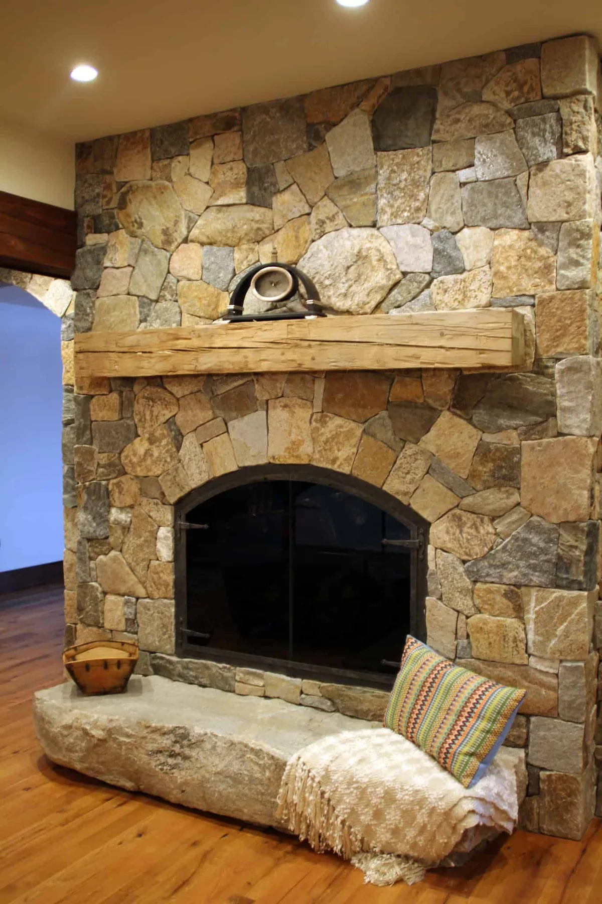
Image source: Bing (Web (fair-use with source credit))
Then step back 6 to 8 feet. Close-up, everything looks fine. From normal living distance, tonal clashes appear.
That step-back is when you actually see the palette, not the paint.
Per our editorial review of renovator feedback, small chips are the number one reason people buy a color that fails in person. The patch and the step-back are non-negotiable.
Palette Direction: Warm, Cool, Neutral, or High-Contrast
Now you've got the data. Time to pick a direction. Each one produces a different feeling, and each is best for a different type of room.
What Each Direction Does to the Room
- Warm palette: cozy, inviting, traditional. Best for living rooms, great rooms, and rustic builds. If your stone is warm, this is your natural lane.
- Cool palette: calm, modern, slightly formal. Best for contemporary spaces and rooms with lots of natural light.
- Neutral palette: flexible, timeless, hard to get wrong. Best when you're unsure or want resale-friendly results.
- High-contrast palette: dramatic, designer-feeling. Best for feature walls in larger rooms. Beware in small rooms, where it overwhelms.
For each direction, the goal is the same. The stone leads. The rest follows.
Matching Stone and Walls vs. Contrasting Them
Matching stone and walls creates a seamless, seamless look. It makes the room feel larger and calmer. It's the safer choice and it rarely goes out of style.
Contrasting stone and walls creates drama and draws the eye. It works when the stone is a true feature and the room can handle the tension. In a small room, contrast shrinks the space visually.
Match if you want calm. Contrast if you want impact. There's no universally right answer, only the one that fits your room and how you use it.
Why Same Palette Looks Different on Ledgestone vs. Smooth Limestone
Here's a visual quirk worth knowing. The same three colors land completely differently depending on stone format.
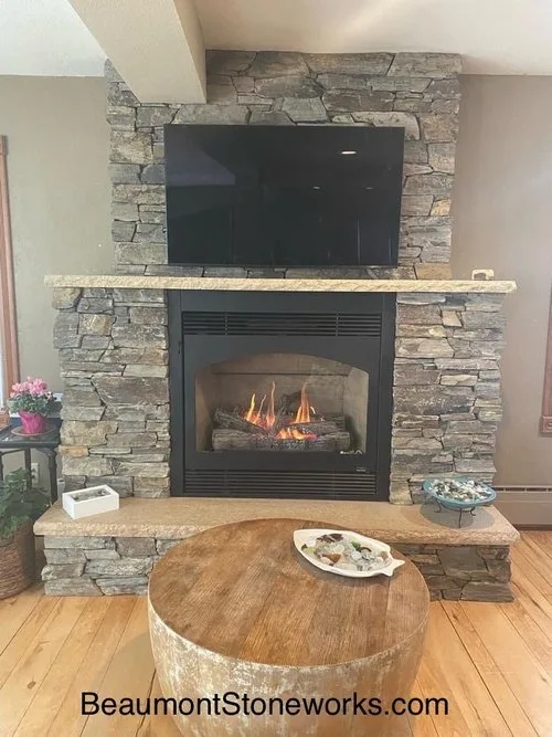
Image source: Bing (Web (fair-use with source credit))
Ledgestone is made of many small stacked pieces, each with its own slight color shift. That variation adds visual texture. A palette on ledgestone reads busier and more organic.
Smooth limestone has a more even face. The same palette reads cleaner, calmer, and more uniform. A color that feels lively on ledgestone can feel flat on limestone, and vice versa.
So test on your actual stone. Never assume a palette transfers from one stone format to another. The format changes the result as much as the color does.
Common Visual Mistakes That Wreck a Stone Fireplace Palette
The fastest way to ruin a good palette is to skip the visual checks. These are the mistakes we see most often, and each one has a simple fix.
Choosing paint from a 2-inch chip. Tiny swatches hide undertones. Paint a 12-inch patch and step back 6 to 8 feet. The color that survives the step-back is the one that ships.
Ignoring grout and mortar color. Grout is a permanent design element, not an afterthought. Bright white grout on warm tan stone reads harsh. Charcoal grout on pale limestone reads heavy.
Match grout to the stone's secondary tone, or go one shade darker at most.
Fighting the floors. Warm oak floors plus cool grey stone plus cool grey walls equals a split room. Pick one temperature and commit. Floors are permanent, so let them lead if you're not changing them.
Over-saturating the accent. The 10% accent color is meant to whisper, not shout. A rust mantel on a cream fireplace is a statement. The same rust on cream stone with rust walls and rust furniture is chaos.
Skipping the night check. A palette that looks perfect at 10am can turn muddy under warm 2700K bulbs at 9pm. View every sample twice. Daylight and evening light are different rooms entirely.
Assuming all ledgestone reads the same. Color variation between individual stones means the same paint can land busier than expected. Test against the actual wall, not a sample photo.
Stone Fireplace Palette FAQs
What's the safest palette for a stone fireplace?
A neutral, tone-matched palette is the safest bet. Pull the dominant color from your stone, use it on the walls, and let the stone's secondary tone carry the mantel. Three colors total.
This approach works across styles and holds up at resale, which is why designers default to it when the homeowner is unsure.
Should the walls be lighter or darker than the stone?
Lighter walls open the room and make the stone pop. Darker walls add drama and shrink the space visually. In small rooms, go lighter.
In large great rooms, darker walls with lighter stone can look striking. Match undertones either way, or the contrast will read as a mistake instead of a choice.
Can I paint stone that's the wrong color?
Yes, but not with regular wall paint. Use a masonry-specific mineral or limewash product made for stone and brick. These breathe with the stone and hold a patina.
Regular acrylic paint traps moisture and peels. Per manufacturer guidance for masonry coatings, always test a small area first and expect the stone's texture to remain visible.
How many colors should a fireplace palette have?
Three, occasionally four. One dominant color, one secondary, one accent. More than that and the wall reads busy.
The 60/30/10 split is a reliable guide. If you're adding a fourth color, it should be a small detail like a metal fireplace screen or a hearth edge, not a major surface.
Does the mantel color have to match the stone?
No. Matching is seamless and safe. Contrasting is dramatic and modern.
The only firm rule is undertone consistency. A warm wood mantel on cool grey stone will always look slightly off, no matter how good the wood looks in the shop. Match undertones, then decide on contrast level.
How do I know if my palette works before I commit?
Test for a full day in the actual room. Tape or paint samples against the stone, then check at morning, midday, and evening. Step back 6 to 8 feet each time.
If the palette holds across all three viewings and the undertones agree, you're done. If anything shifts or clashes, swap that one element and retest.
Final Decision Guide: Locking In Your Palette Before You Buy
By the time you reach this point, the hard work is done. What's left is locking in the decisions in the right order so you don't have to redo any of it later.
Here's the sequence that keeps you out of trouble:
- Fix the stone and grout first. These are the least changeable elements. Decide mortar and grout color before you pick anything else.
- Lock the mantel and hearth. They're the second-most permanent choices. Bring samples home and tape them against the stone for a full day.
- Choose the wall paint. Paint is the easiest to change but the hardest to get right. Paint a 12-inch patch and check it at morning, midday, and evening.
- Then layer furniture and textiles. These are movable, so they should never drive the palette. They fill in around it.
If you follow that order, you'll never be stuck repainting because a colored sofa you bought first forced your hand.
A quick gut-check before you buy: confirm the palette uses no more than three or four colors, that the undertones agree, and that it holds up under both daylight and evening bulbs. If all three boxes check, buy with confidence.
The same beige paint can look warm next to one stone and dingy next to another, and no color wheel or app will spot that for you. Your eyes in the actual room will. That's the whole point of this process, and it's why the visual steps matter more than any rule of thumb.
Per the National Stone Institute's guidance on stone finishes, finish type and color move together, so always treat them as one decision. Nail the stone, and the rest of the room falls in line.

Similar Posts