Warm Tone Gallery Wall Ideas That Transform Any Room
A gallery wall with warm tones isn't about matching everything perfectly. It's about layering terracotta, amber, ochre, and blush pieces so the whole arrangement feels intentional rather than scattered. The problem is that warm palettes are the easiest to get wrong.
Add one too many saturated pieces and the wall turns muddy. Add too few and it reads flat.
In our research, we looked at spacing standards from professional framing guides and lighting specs from the Illuminating Engineering Society. The numbers matter more than most people expect. A 2 to 3 inch gap between frames and a light source around 2700K keep a warm wall looking curated.
Here's how to pull it off without a designer.
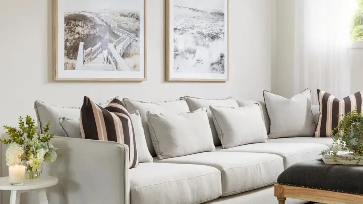
gallery wall with warm tones
A gallery wall with warm tones uses earthy colors like terracotta, amber, rust, and cream. Mix muted artwork with brass or warm wood frames. Keep spacing at 2 to 3 inches between pieces.
Hang the center near 57 inches off the floor. Add warm 2700K lighting to tie the palette together.
Why Warm Tones Change Everything About a Gallery Wall
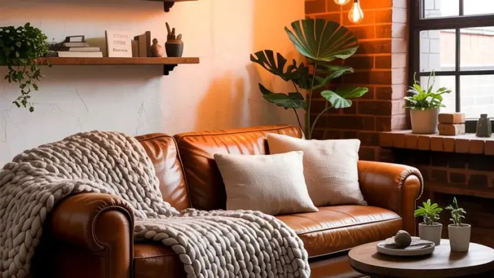
Warm tones do something cool colors can't. They pull the eye across a room and make a space feel lived-in. A cool-toned wall reads crisp and modern.
A warm one reads welcoming and rooted.
That emotional pull is the whole point. It's also why warm walls fall apart so easily.
The challenge is contrast. Warm colors sit close to each other on the color wheel. Terracotta, amber, and rust are practically neighbors.
Stack a dozen neighboring tones together and they blur into one flat wash of orange. The fix is tonal hierarchy, which means varying light, medium, and dark values inside the same warm family.
Texture does the rest of the work. A smooth glossy print next to a nubby woven textile gives the eye something to grab onto. Per lighting industry guidance, warm light sources also shift how these tones read on the wall, so a piece that looks muted under daylight can glow amber at night.
Think of the wall as one composition, not twenty separate frames. When it's done right, no single piece fights for attention.
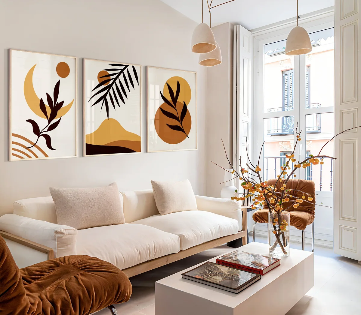
Image source: Bing (Web (fair-use with source credit))
Pick Your Palette Before You Pick a Single Frame
Palette first, frames second. That order saves you from buying frames that don't talk to each other. Frames are the connective tissue here.
Get them wrong and the art never recovers.
Start by choosing three or four anchor tones. Good warm anchors include terracotta, burnt sienna, mustard, ochre, camel, and blush. Add one neutral to breathe, like warm ivory, cream, or mushroom.
That neutral keeps the palette from suffocating.
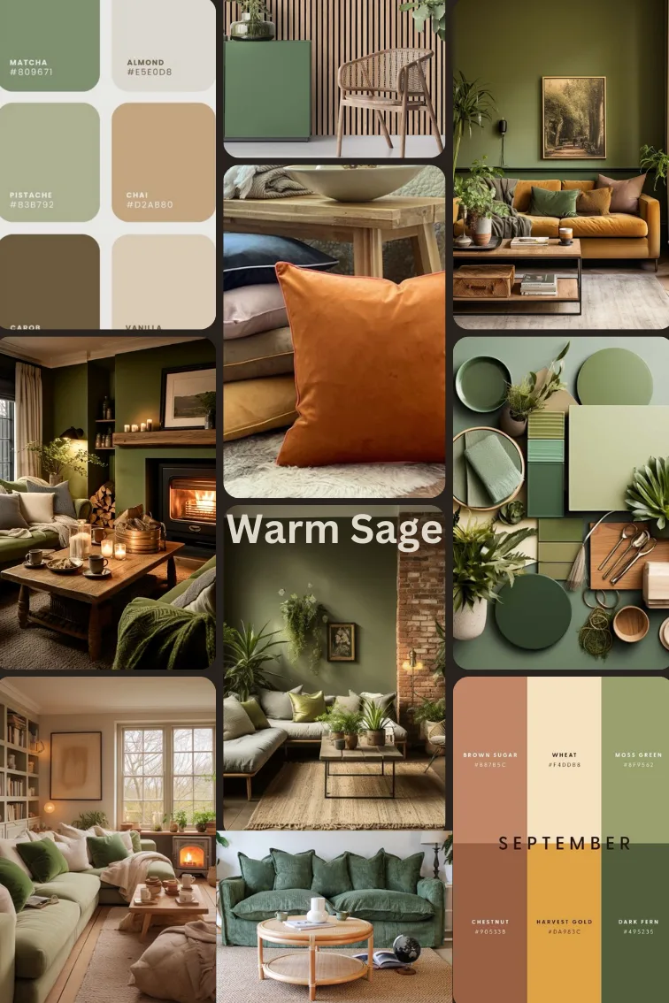
Image source: Bing (Web (fair-use with source credit))
Here's a simple rule for building the palette:
- Pick one saturated tone (terracotta or rust).
- Pick one mid-tone (camel or amber).
- Pick one light tone (blush or cream).
- Pick one dark tone (mahogany or deep brown) for grounding.
Now the frames. Warm frame finishes include brass, antique gold, bronze, copper, and warm woods like walnut, oak, and teak. Black frames can work too, but they cool the palette fast.
Use them sparingly if at all.
One more thing. Warm tones can read yellow under cheap bulbs. If your black frames suddenly look green, your lighting is the culprit, not the frames.
The Layout Rules That Keep a Warm Wall From Turning Muddy
Layout is where warm walls either sing or sink. The goal is balance, not symmetry. You want the eye to move around the wall without hitting a dead zone.
A salon-style hang works best for warm palettes. Tight groupings of uneven pieces feel collected and personal. A rigid grid feels more formal and can make warm tones look mechanical.
Anchor the wall with a hero piece first. This is your largest work, ideally 1.5 to 2 times the size of your smaller pieces. Hang it slightly off-center, then build outward.
Space pieces 2 to 3 inches apart. Tighter than that and the wall feels cramped. Wider and it loses cohesion.
If you're working with a narrow wall or a staircase, run the arrangement along the diagonal. Warm tones especially benefit from a loose, organic flow. Rigid rows flatten them.
Here's how the main layouts compare:
| Layout | Best For | Warm-Tone Fit |
|---|---|---|
| Salon-style | Eclectic collections | Excellent |
| Tight grid | Modern, uniform art | Fair |
| Linear row | Hallways, above sofas | Good |
| Staircase diagonal | Tall walls | Good |
| Asymmetrical | Mixed sizes | Excellent |
The asymmetrical and salon layouts almost always win for warm palettes. They give the eye room to wander.
Step-by-Step: From Floor Layout to Final Hang
Lay everything out on the floor first. This is the step people skip, and it's the one that saves holes in the wall.
- Measure your wall width and the width of the furniture below it. Your arrangement should sit within that span.
- Lay all pieces on the floor and shuffle until the balance feels right. Step back often.
- Trace each frame onto kraft paper or newspaper and cut out the templates.
- Tape the templates to the wall in your final arrangement.
- Mark hanging points on each template, whether that's a D-ring, sawtooth, or wire.
- Install hardware. Use wall anchors for anything over 5 pounds on drywall.
- Hang the hero piece first, then work outward.
- Level each frame with a spirit level as you go.
- Step back and adjust spacing to a consistent 2 to 3 inches.
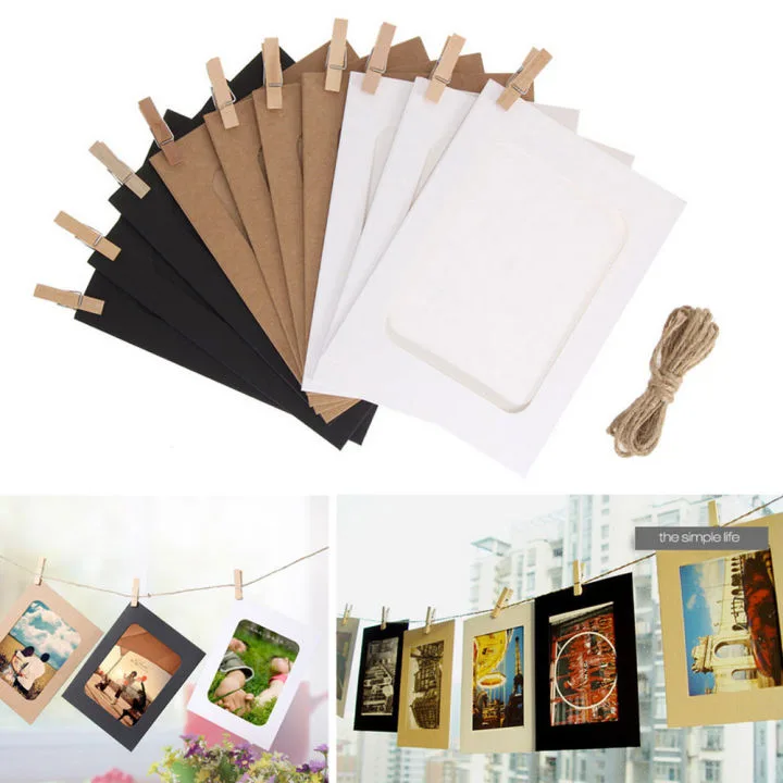
Image source: Bing (Web (fair-use with source credit))
If you rent, adhesive strips are a real option. Manufacturer specifications from 3M list weight ratings from 1 pound up to 16 pounds depending on the strip. Check the rating before you trust it with glass or heavy frames.
The whole process takes about two to three hours for a wall of ten to fifteen pieces. The floor layout eats most of that time, and it's worth every minute.
What to Put on the Wall Beyond Just Framed Prints
Framed prints are the obvious choice. They're also the fastest way to make a warm wall look like a store display. Mix in other media and the wall starts to feel collected.
Here's what works with warm palettes:
- Textiles like woven hangings, embroidery, and macramé in earth tones.
- Small ceramic plates or tiles mounted in shadow-box frames.
- Vintage brass or copper objects on a small floating shelf.
- Travel photography printed on matte paper to avoid glare.
- Family portraits in warm-toned frames, kept to a tight cluster.
Matte finishes beat glossy ones here. Glossy prints throw reflections that break the warm, soft feel. If you're framing anything valuable, ask for UV-filtering glazing.
Sun fading is real and it hits warm tones especially hard.
Keep the mix intentional. Two textiles, a few prints, and one sculptural object is plenty. More than that and the wall starts to look like a flea market.

Similar Posts